cadre
Re‑framing Performance Wear as Quiet Discipline

Cadre is a conceptual branding project exploring a new direction for performance-wear culture. In a category saturated with intensity, noise, and hyper-masculine energy, this project asked a different question: what if performance was quiet?
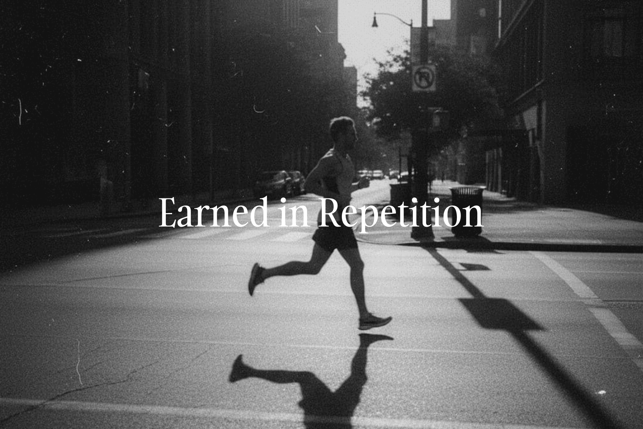
The performance apparel market is visually loud and emotionally exaggerated. Campaigns celebrate peak moments — podiums, sprints, sweat, victory. But most performance isn’t cinematic. It’s repetition. Early mornings. Structure. Discipline. The challenge was to build a brand system that could hold that truth — and still feel aspirational. How do you create emotional resonance without theatrics? How do you design energy without aggression? How do you build desire around consistency?
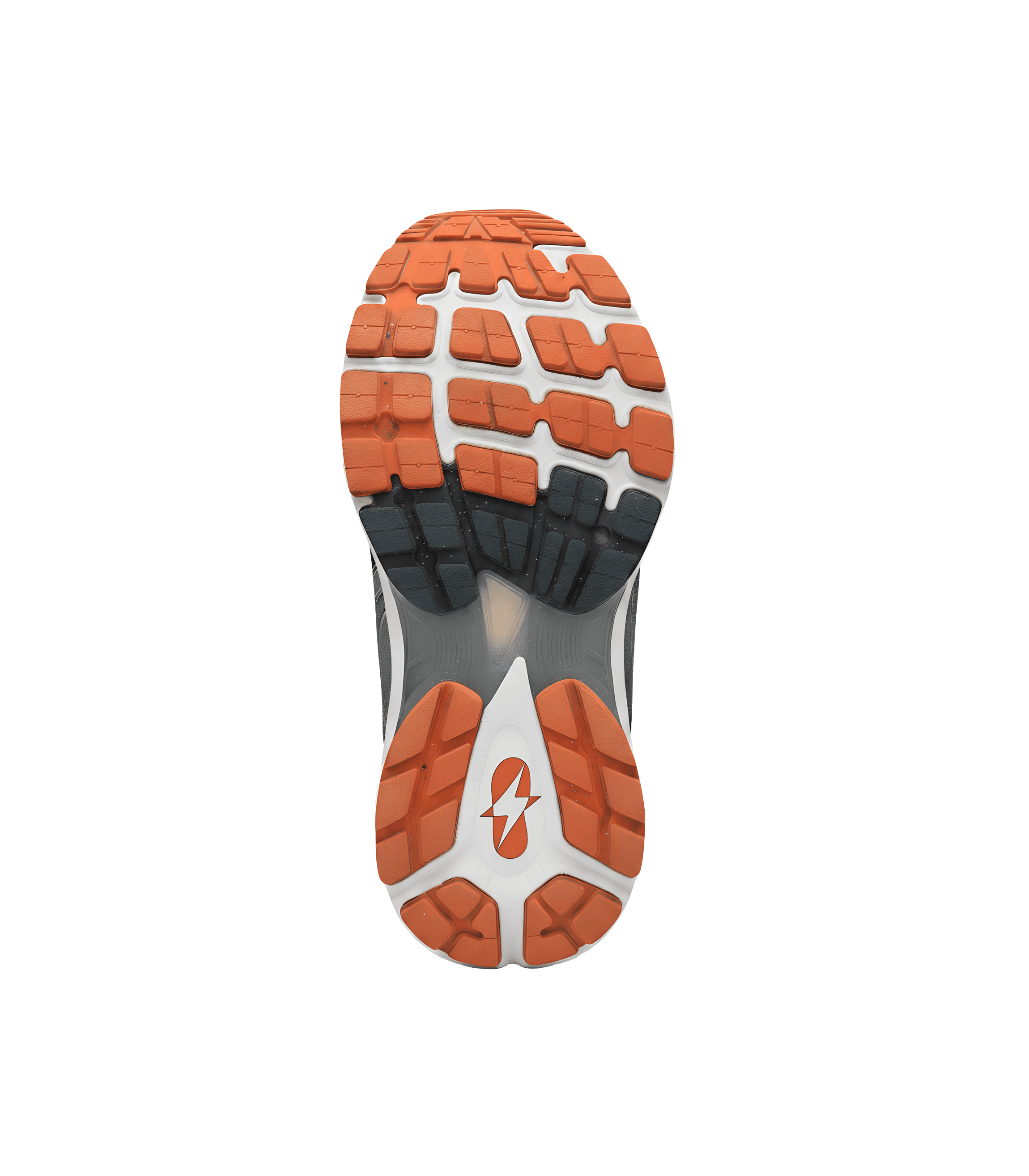
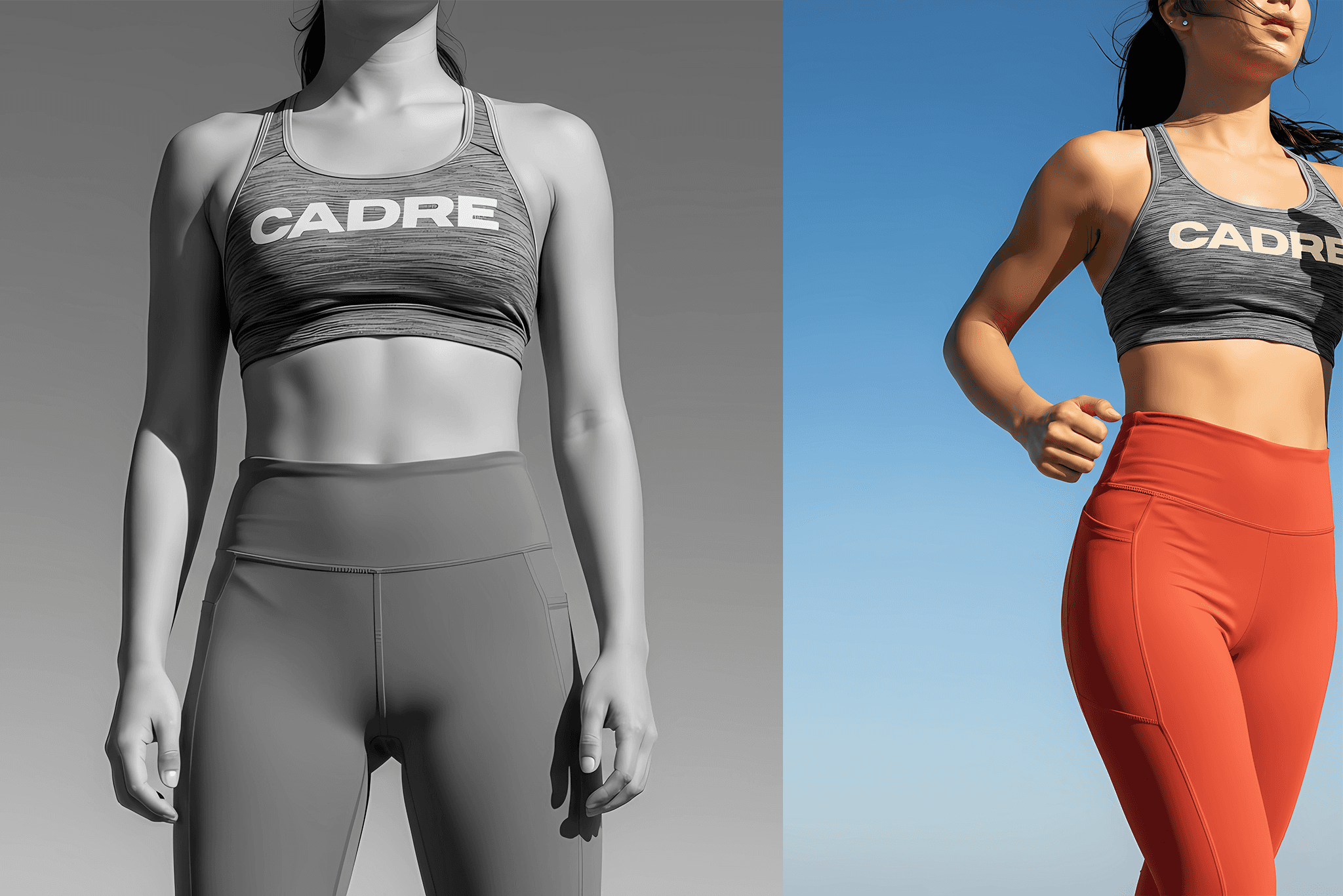
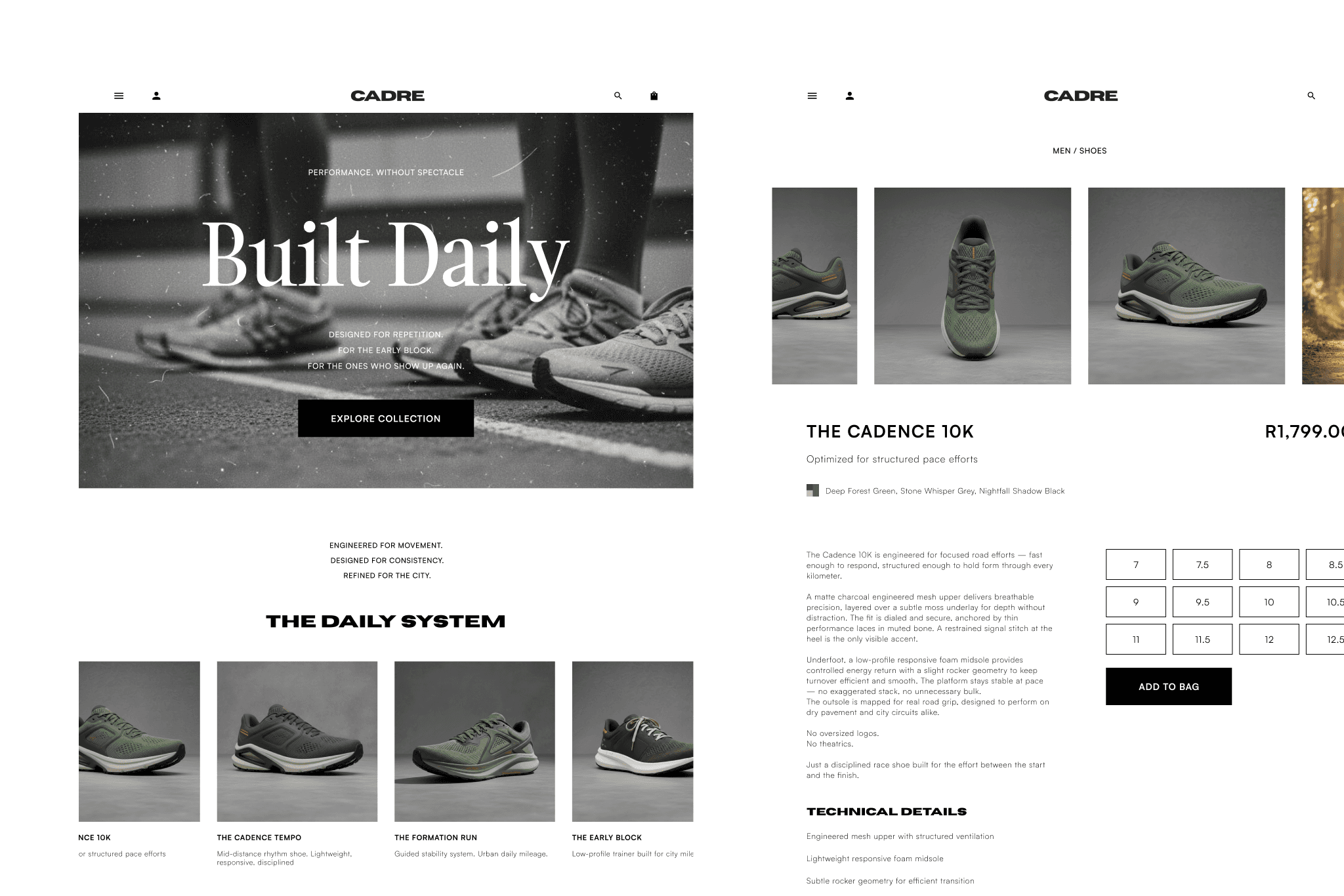
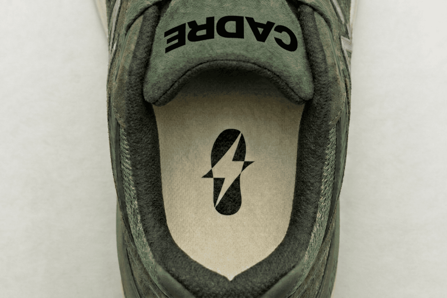
Cadre began as a language exercise. Instead of starting with logos or colour, the project started with tone — removing motivational clichés and replacing them with restraint. Messaging became short, controlled, declarative. Less performance. More practice. From there, the visual direction followed. Muted palettes replaced high-contrast sport neons. Typography became structured and disciplined. Photography leaned toward movement studies rather than staged hero shots. Every decision was filtered through a single lens: Does this feel measured? Or does it feel loud? The brand system was built to feel architectural — scalable across apparel, packaging, digital touchpoints, and retail environments without ever needing to shout.
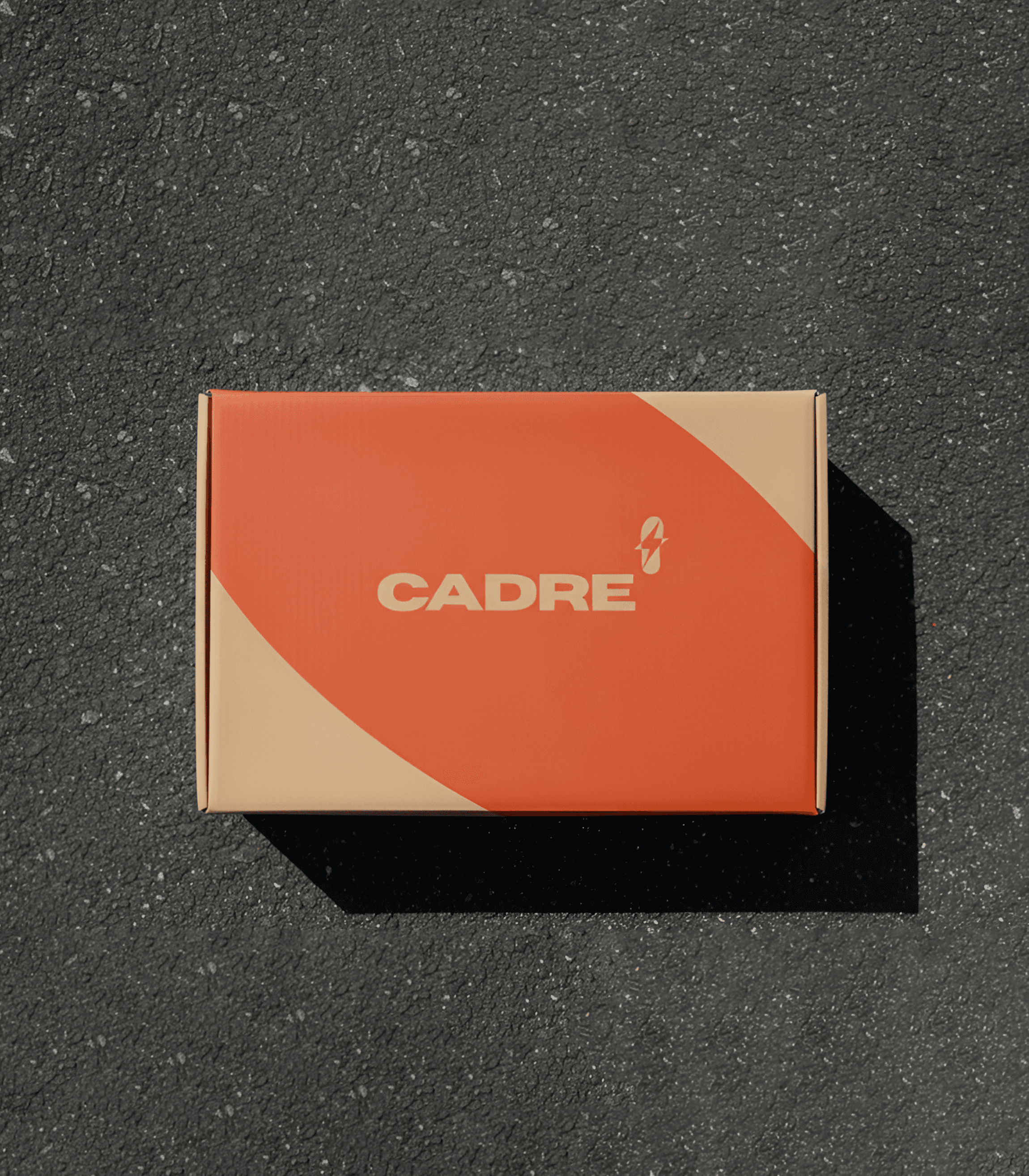
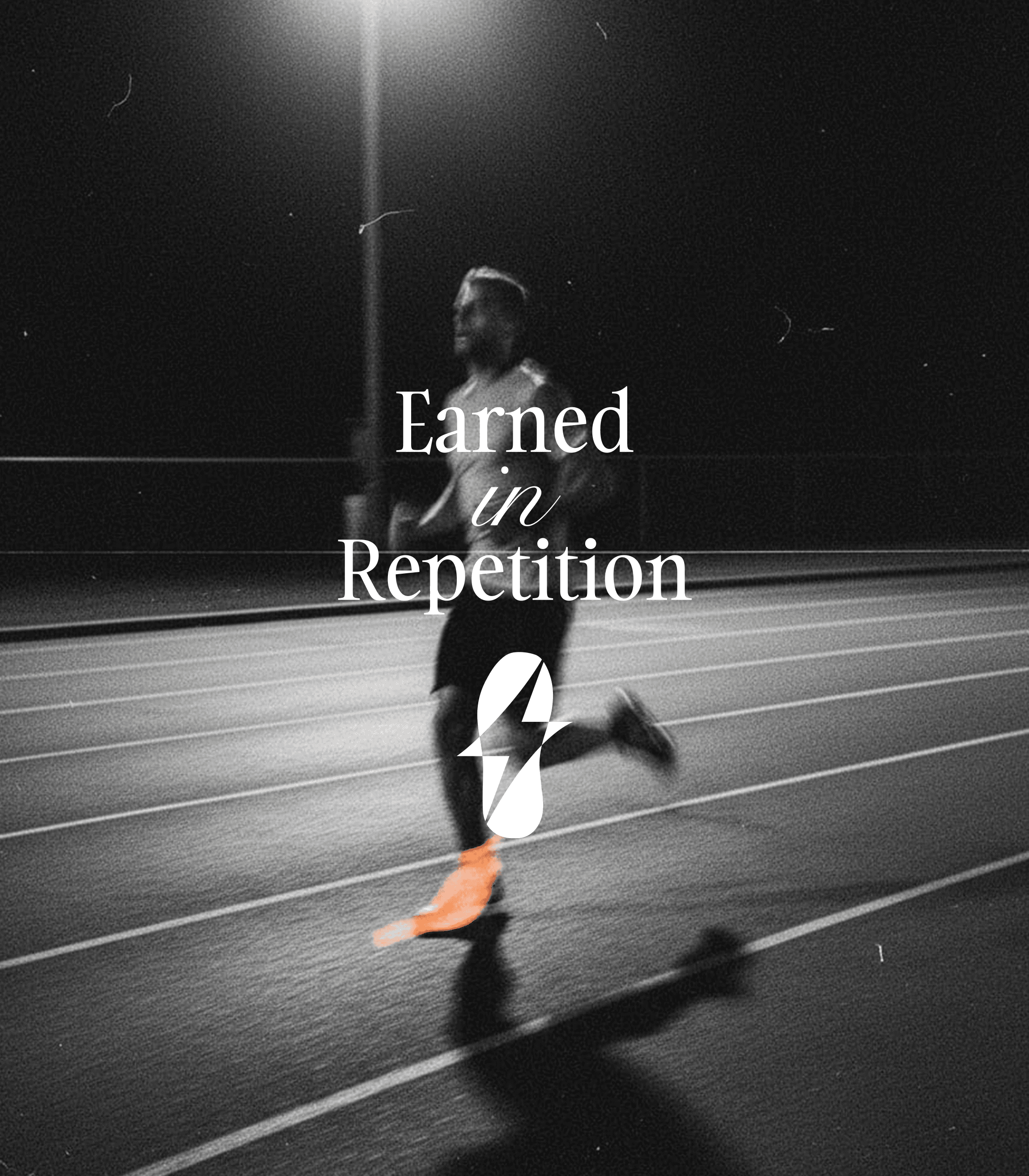
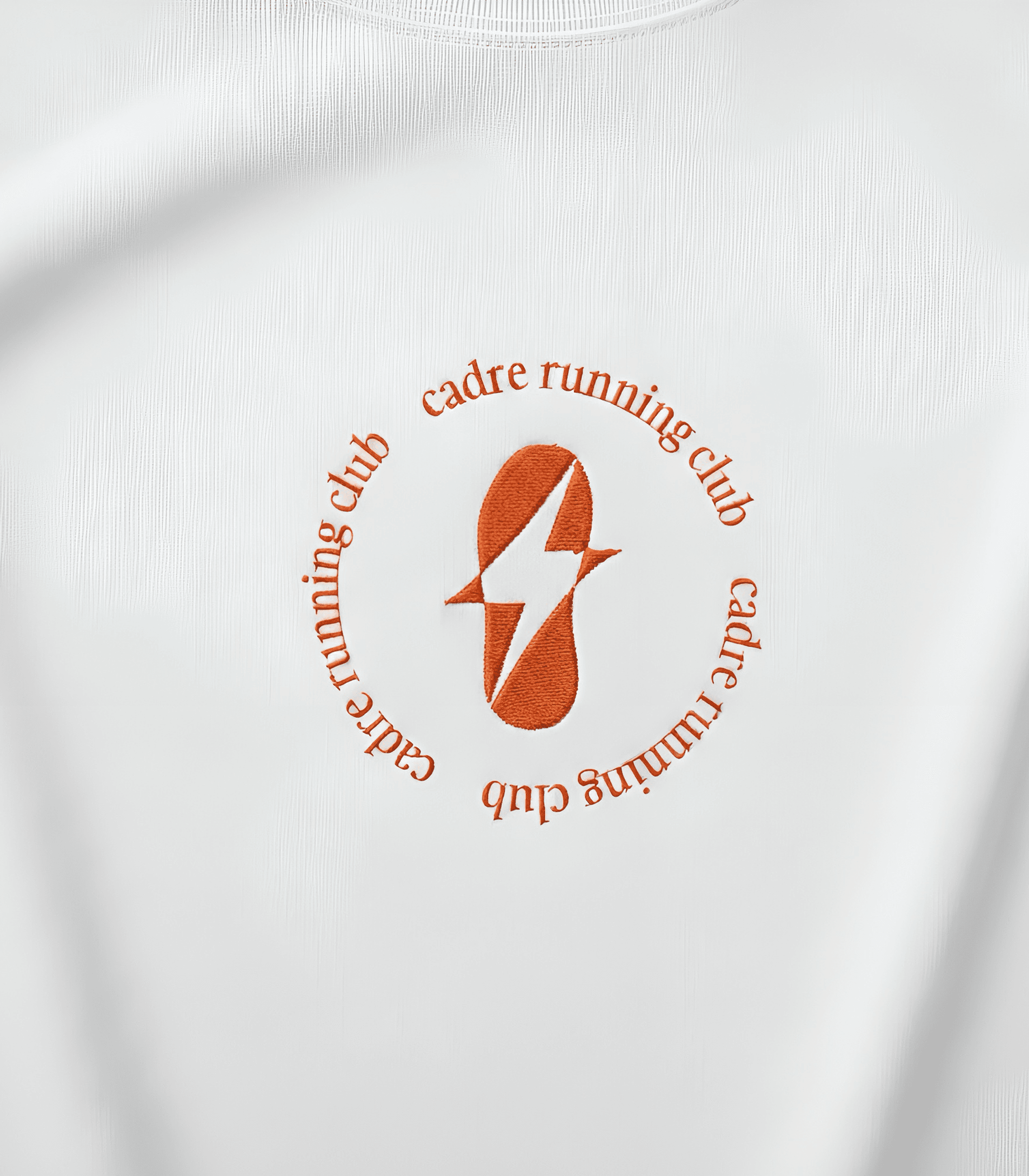

Cadre emerges as a performance brand rooted in cadence. The identity system centers on structure: minimal logotype, restrained colour palette, disciplined typography, and product-forward storytelling. Apparel graphics use micro-messaging and internal placements rather than bold chest hits. Visuals prioritize motion, texture, and realism over dramatized spectacle. The tagline anchors the philosophy, Earned in Repetition Rather than selling a finish line, Cadre sells the block — the repetition that builds it.