Rayden
Reframing Solar as Infrastructure
Residential solar has reached mainstream adoption, yet its branding remains trapped in early‑2000s sustainability language—optimistic, loud, and visually disconnected from contemporary architecture. Rayden was developed as a conceptual rebrand for a solar manufacturer and installer operating within premium residential environments, positioned at the intersection of energy infrastructure and modern living. The ambition was not to redecorate solar aesthetics, but to rethink how energy should behave culturally. Rather than treating energy as a lifestyle accessory, Rayden is positioned as a foundational layer—something that is quiet, integrated, and inevitable.
Solar companies largely communicate through persuasion: savings claims, environmental messaging, or technological spectacle. This creates a paradox. The more visible energy branding becomes, the less it feels trustworthy or permanent. Homeowners investing in long-term infrastructure are not seeking excitement — they are seeking certainty. The challenge became clear: How do you sell solar without making solar the hero? The brand needed to move away from eco-marketing tropes and instead align with architecture, longevity, and calm reliability — positioning energy as a foundational layer rather than a lifestyle statement.


The project began by reframing energy through a cultural lens rather than a technical one. Research explored how infrastructure brands outside the energy category communicate trust: transportation systems, architectural materials, and industrial design companies that succeed by being quietly essential rather than emotionally persuasive. Instead of starting with logo exploration, the process focused on behavioral principles: Energy should feel stable. Energy should feel integrated. Energy should feel inevitable. Visual exploration followed these ideas, testing how branding could exist in environments without demanding attention — appearing on installation vehicles, hardware systems, digital interfaces, and service moments rather than promotional imagery. Early studies emphasized material realism, restrained typography, and documentary-style photography to remove the artificial polish common in renewable energy marketing. The brand system evolved through iterative visual prototyping, exploring how identity could live naturally inside residential environments rather than sitting on top of them.


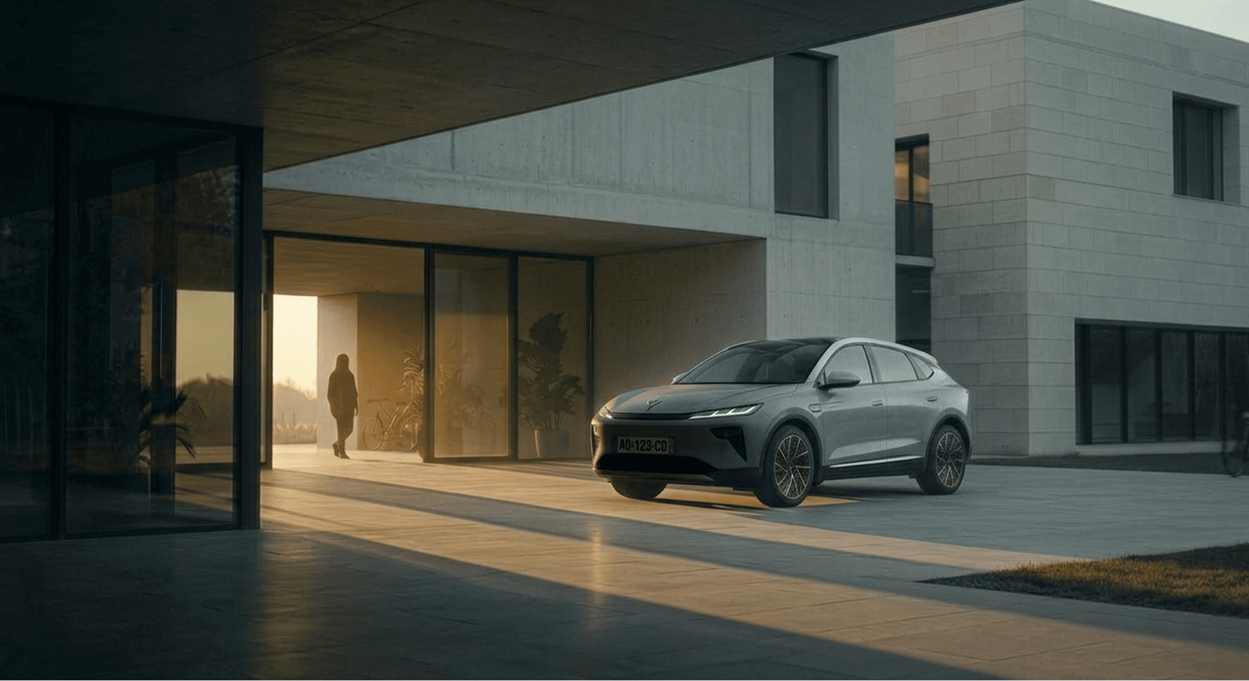
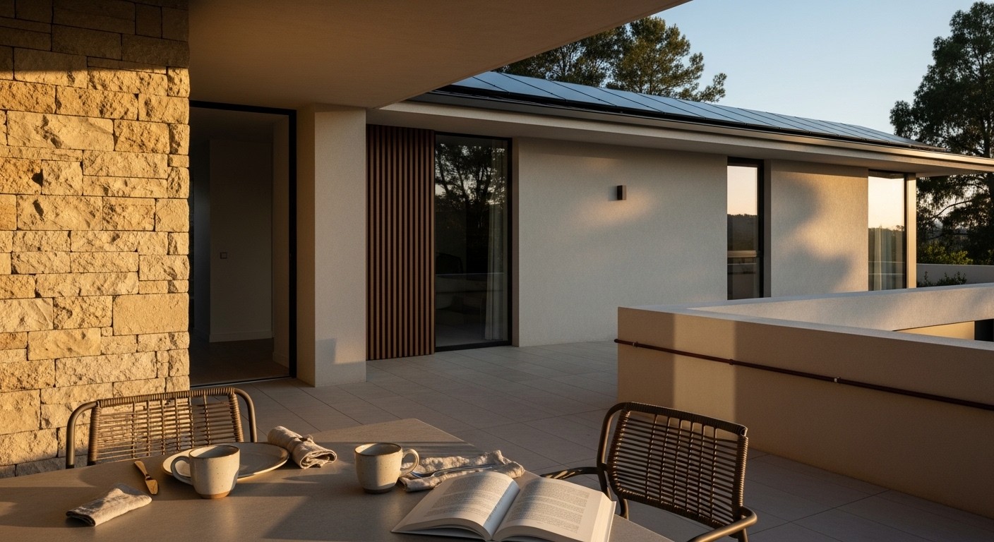
Rayden emerged as an infrastructure-first brand. The identity avoids solar symbolism entirely. No sun icons, leaves, or environmental clichés appear within the system. Instead, the visual language draws from architectural materials and industrial precision. A deep mineral plum (#750851) became the primary brand colour — unexpected within the energy category yet grounded and sophisticated when applied to vehicles, equipment, and service touchpoints. Typography is restrained and editorial, designed to feel engineered rather than expressive. Branding appears sparingly, often secondary to environment and material. Photography direction favors quiet documentary realism: fixed perspectives, natural light movement, and environments that communicate permanence rather than promotion. Across applications — installation vans, residential garages, digital monitoring interfaces, and physical service tools — Rayden behaves less like a product brand and more like a trusted utility redesigned for contemporary culture. The result is a brand that sells confidence instead of conversion.