eva
Reframing the Premium Baby Category as Design‑Led Essentials

The premium baby category had reached aesthetic saturation. Soft neutrals. Handwritten logos. Muted Scandinavian sameness. Eva was envisioned as a corrective — a design-led baby essentials brand built for parents who refuse to dilute their taste when they enter parenthood.

The baby aisle infantilizes parents. Despite rising design literacy among millennial and Gen Z consumers, most baby brands default to visual fragility — pastel palettes, playful typography, and over-sentimental storytelling. The tension was clear, modern parents curate their homes, wardrobes, and digital spaces with intention — yet baby products rarely reflect that same visual standard. Eva needed to exist in the space between care and confidence. The question wasn’t how to make it “cuter.” It was how to make early life feel powerful.

The process began with cultural positioning rather than aesthetics. We mapped the competitive landscape across three dominant territories: – Scandinavian minimal softness – Clinical engineering-led brands – Fashion-adjacent playfulness Each occupied space — but none owned graphic authority. From there, the strategy crystallized; Early life deserves clarity. Research focused on a specific behavioral insight: new parents don’t abandon their design standards — they adapt them. Homes remain intentional. Objects remain curated. The emotional shift into parenthood doesn’t require aesthetic compromise. This reframed the design brief. Instead of shrinking the brand into nursery tropes, we elevated it into modernist territory — borrowing from fashion systems, editorial design, and object-based branding. The identity was developed as a system, not a logo. Every iteration asked the same question: Does this feel culturally confident?
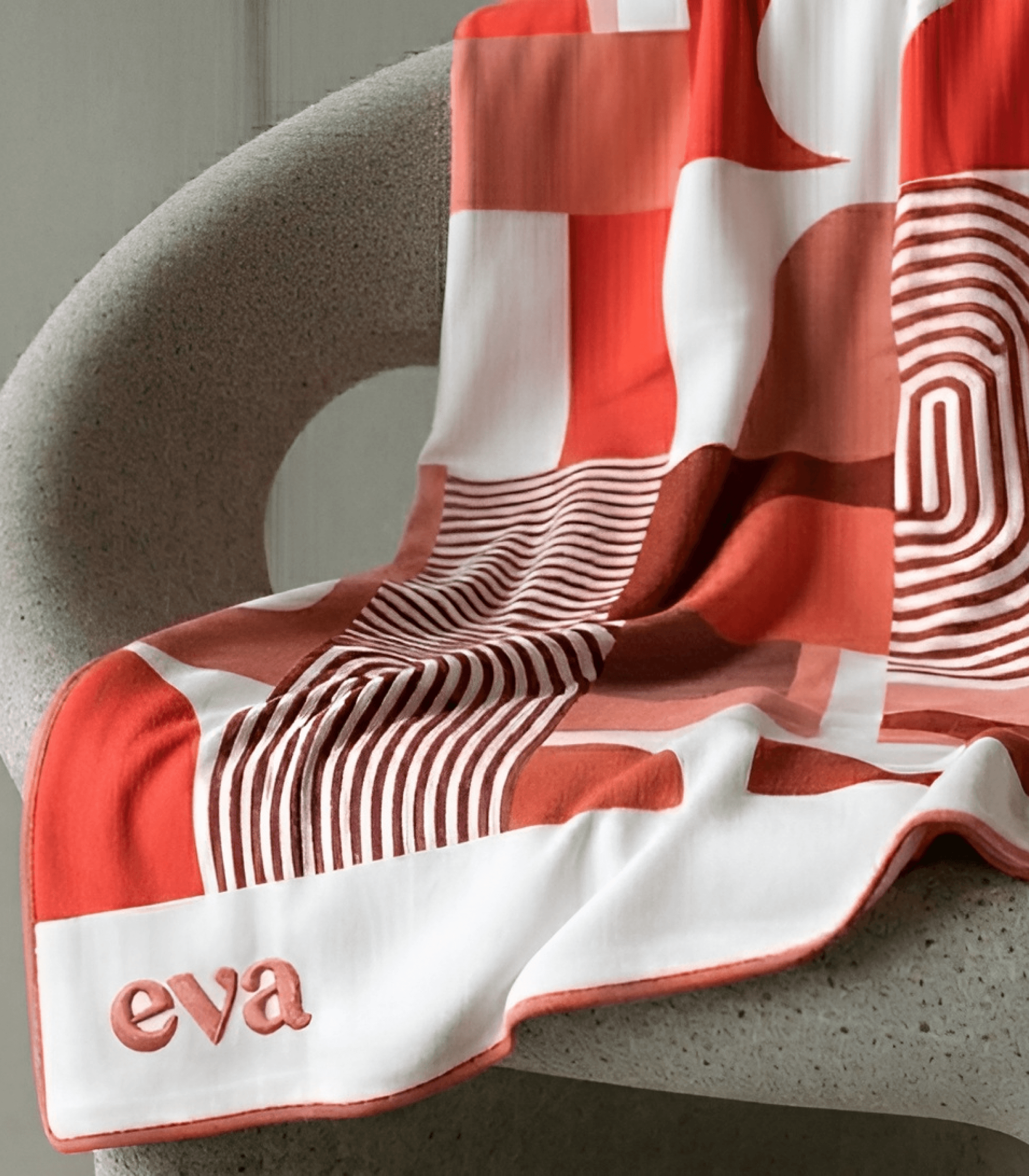
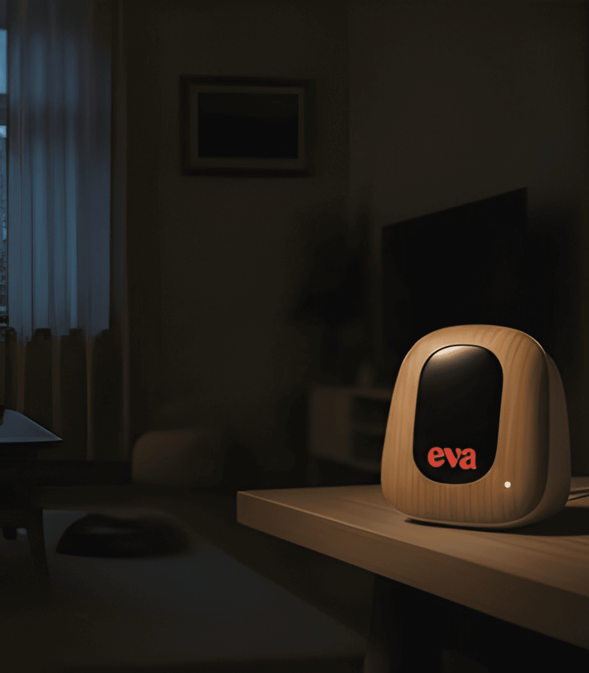
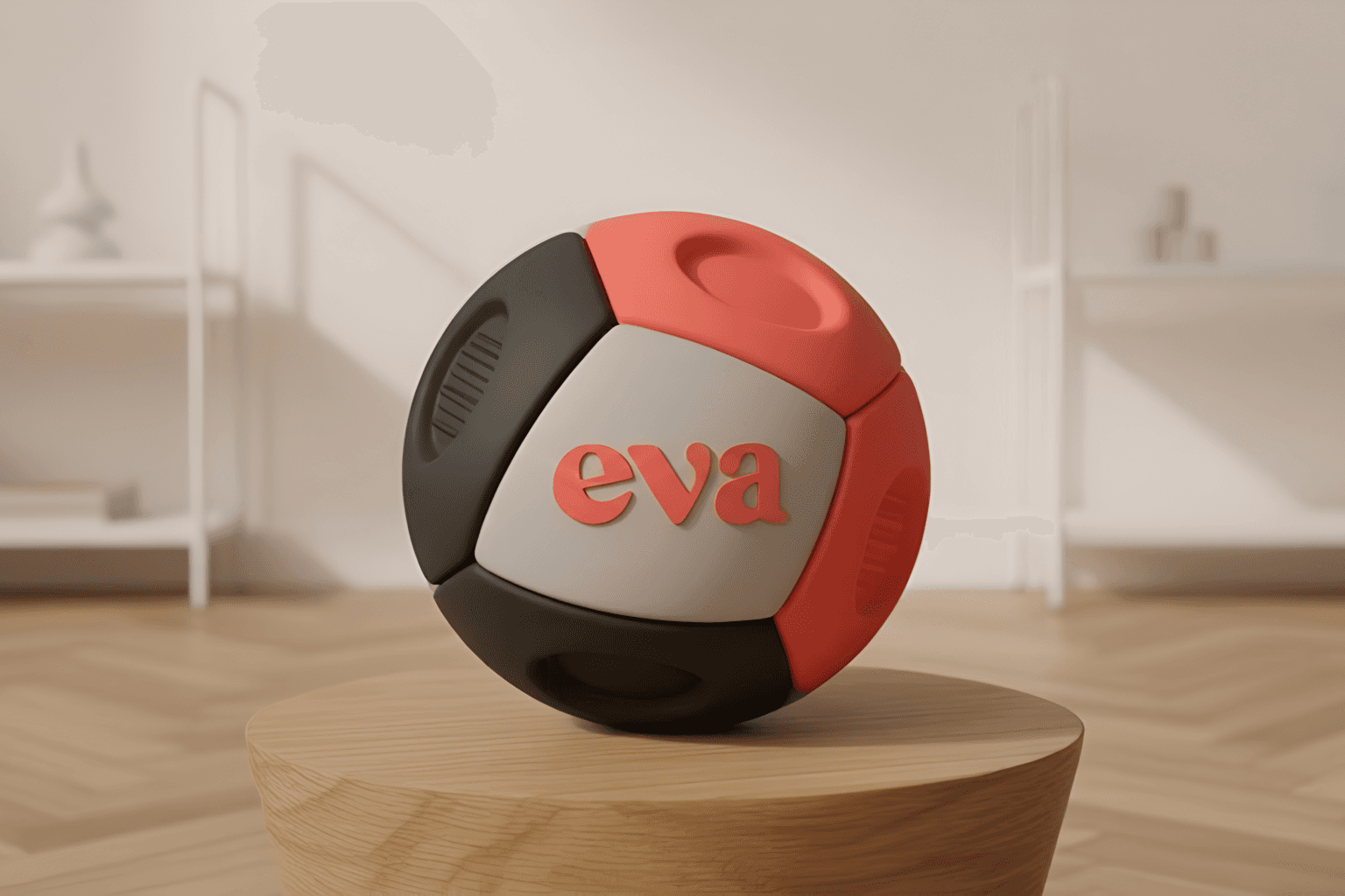

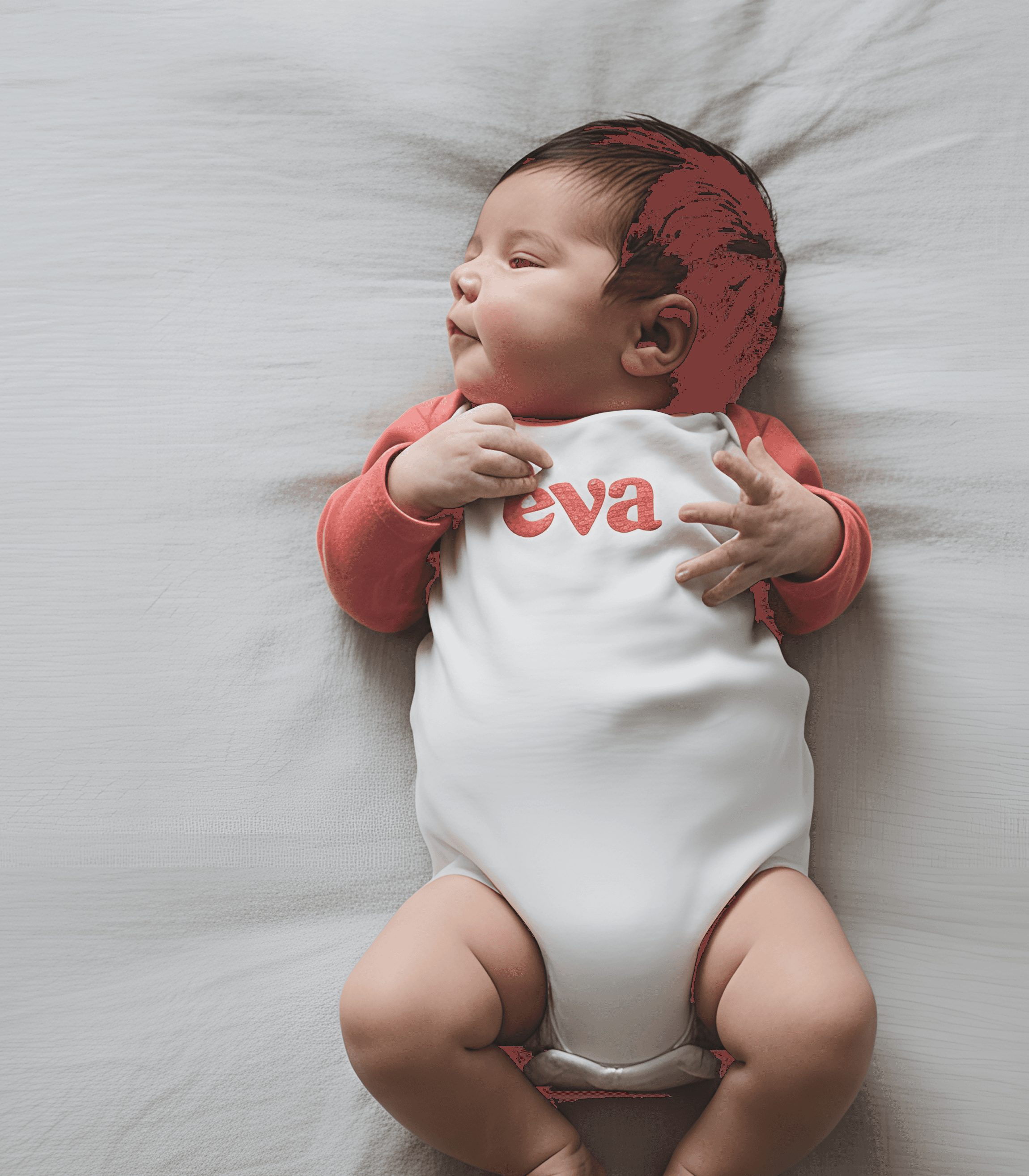
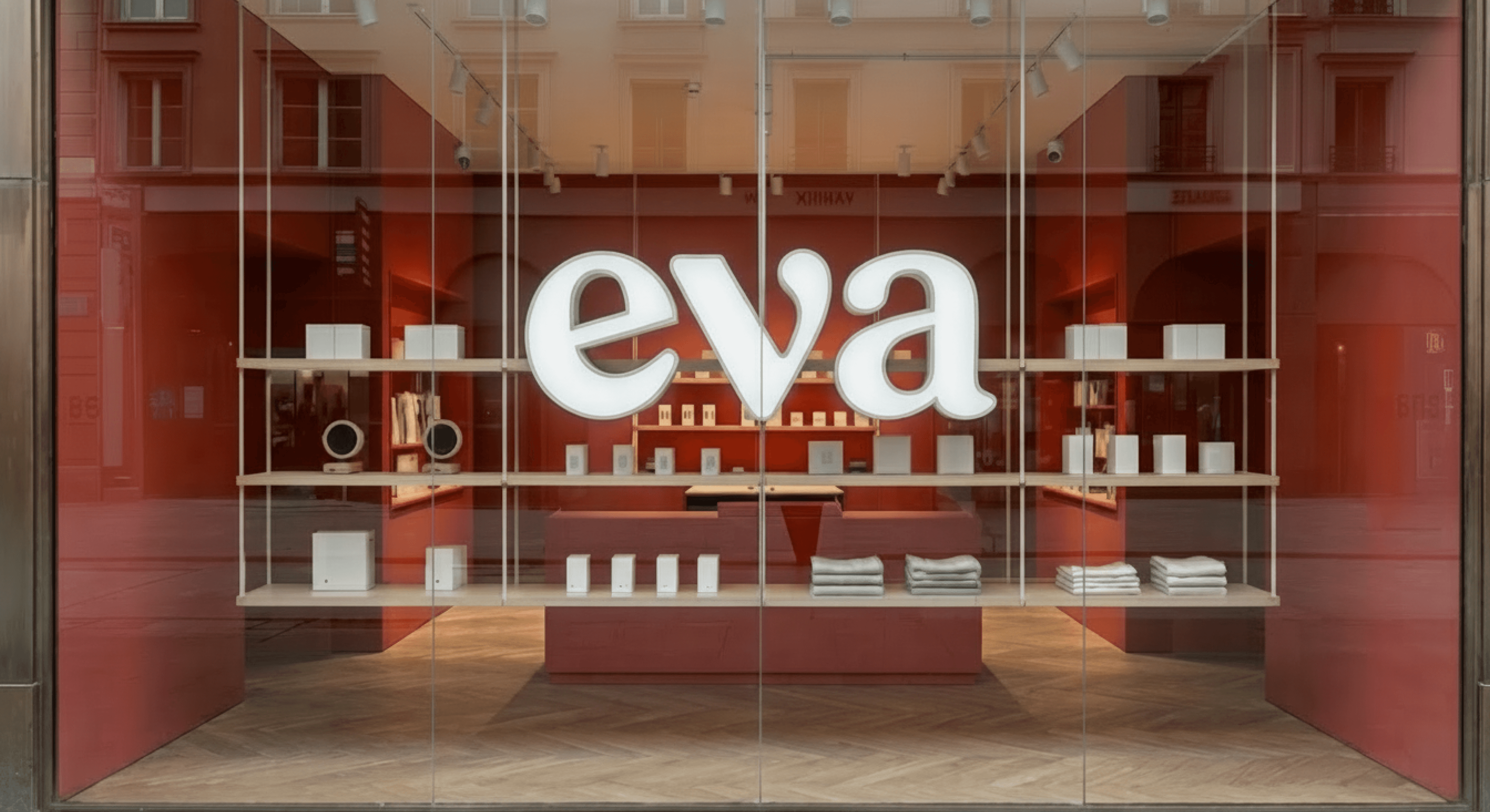
The final identity positions Eva as a design object within the baby category. At its core is a bold, evenly constructed wordmark — soft in curve, strong in stance. The forms carry warmth without whimsy. No quirky spacing. No uneven personality tricks. Just controlled geometry and confident rhythm. The coral became the brand’s anchor — saturated, modern, unmistakable. Used at scale, it transforms packaging into signal rather than decoration. A companion monogram extends the system, allowing the brand to exist in minimal applications: woven tags, embossed lids, digital avatars. The symbol balances maternal softness with graphic structure — a distilled mark that feels iconic rather than ornamental. The result is a baby brand that looks closer to a design house than a nursery label.