HUEVIA
Turning Paint into a Language of Spatial Identity
Huevia is a conceptual paint brand repositioned as a bold, expressive language of color. Pigment becomes personality, empowering design-conscious individuals to define spaces with clarity and confidence — standing deliberately apart from heritage paint clichés.
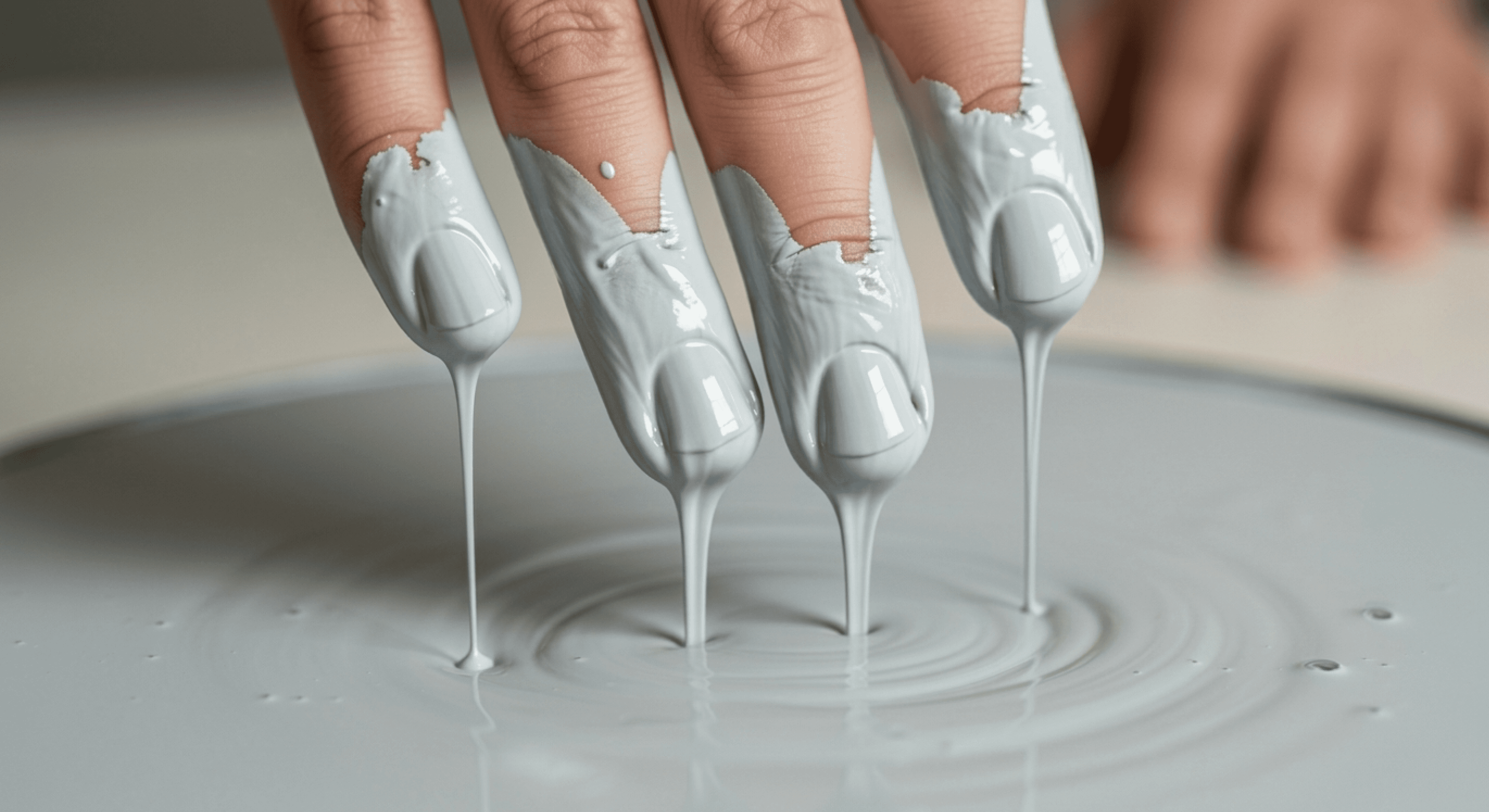
The paint category defaults to heritage nostalgia or mass minimalism. Smiling craftsmen. Dewy brushstrokes. Script logos. Safe neutrals. Color isn't decoration — it's communication. Modern creatives and urban professionals treat walls as canvas, palettes as vocabulary, pigment as identity. Huevia needed to bridge expressive boldness with intelligent restraint — making paint a cultural instrument rather than commodity.
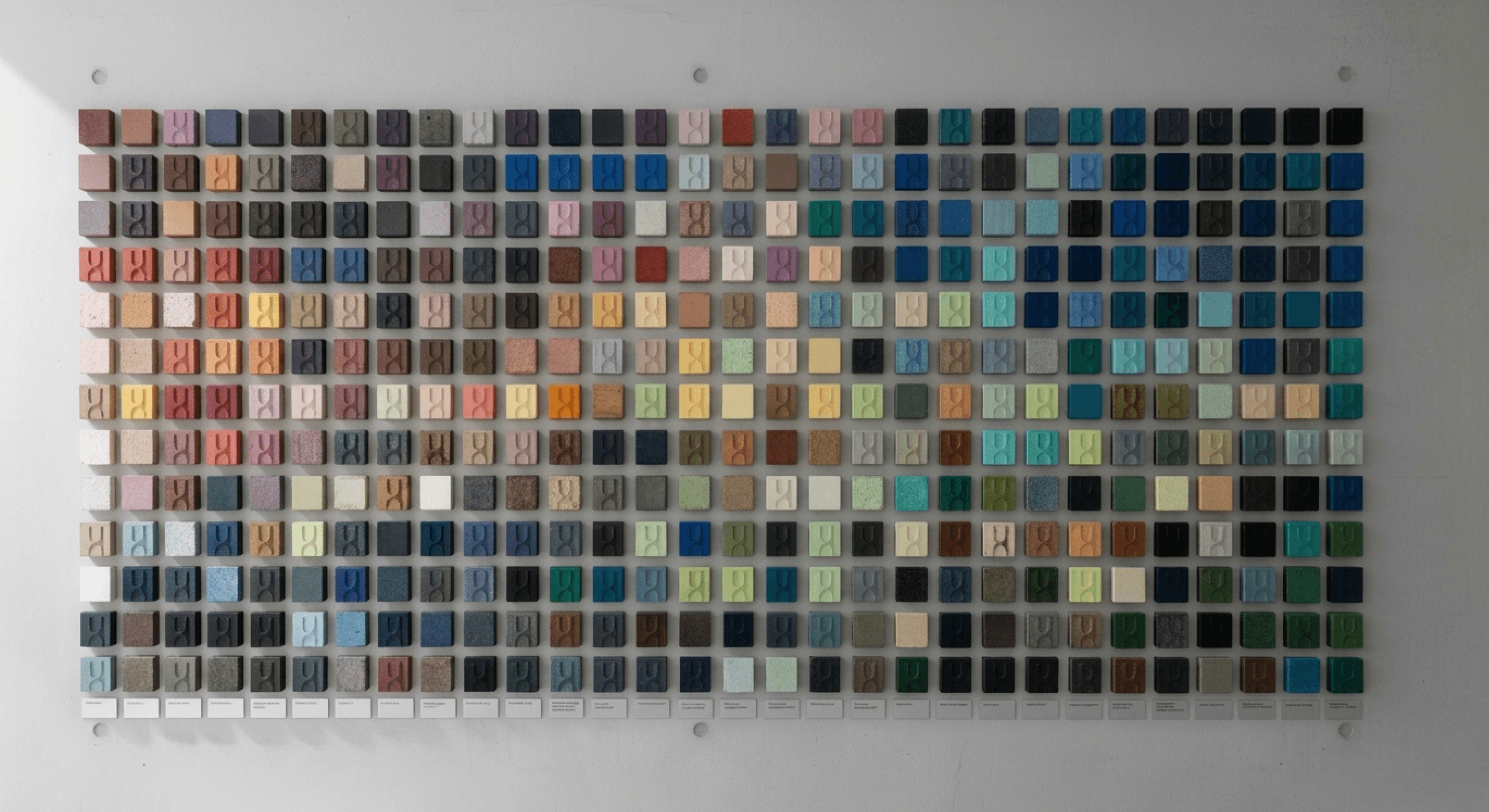
Research mapped emotional color journeys among design-literate users, revealing a gap: they rejected generic finishes but lacked a system to articulate spatial self-definition. Prototypes tested materiality — matte ceramics, brushed aluminum, textured paper — alongside expressive palette personas: crimson as assertive, cobalt as contemplative. The approach asked one question across iterations: Does this speak with intention, or merely decorate?
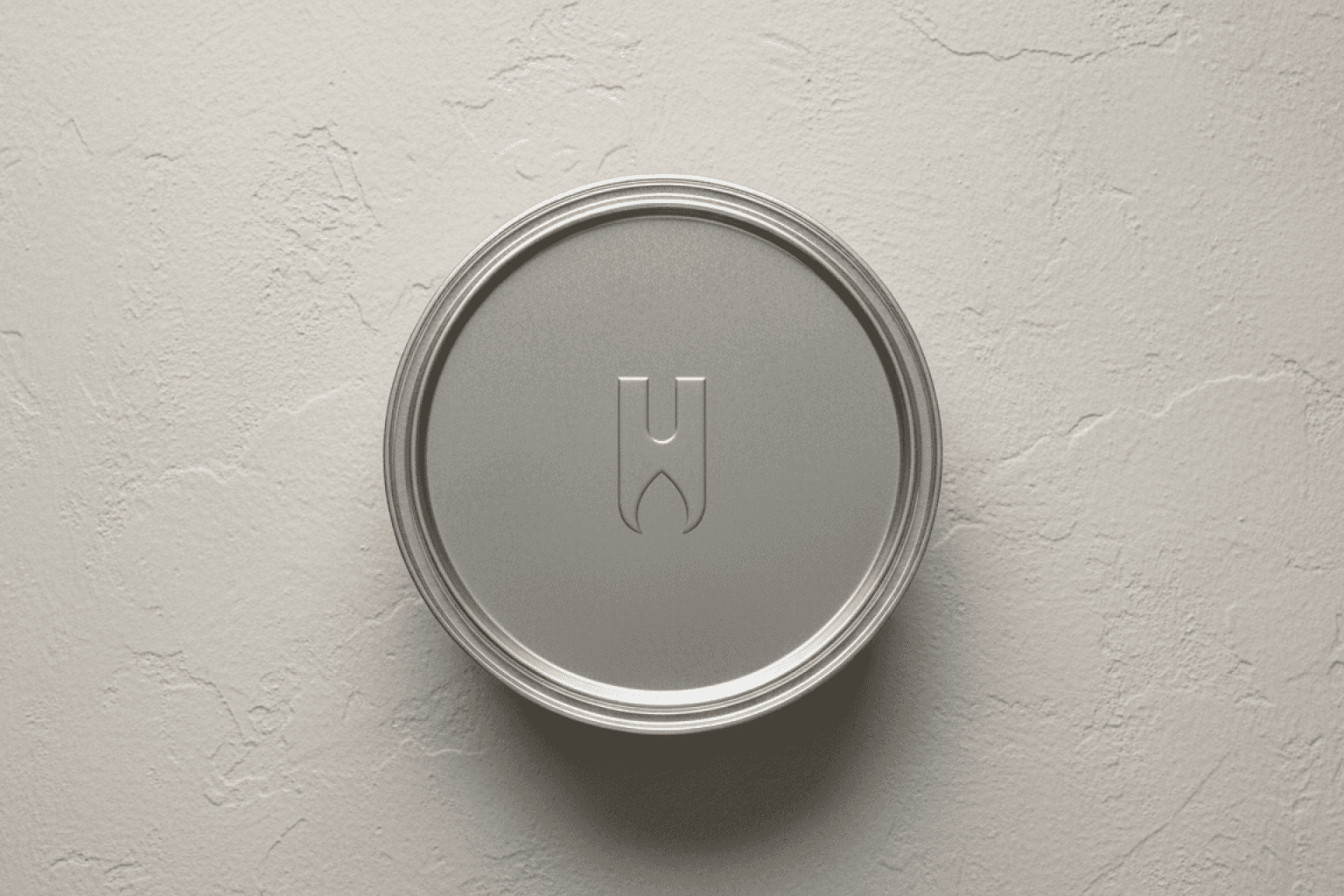
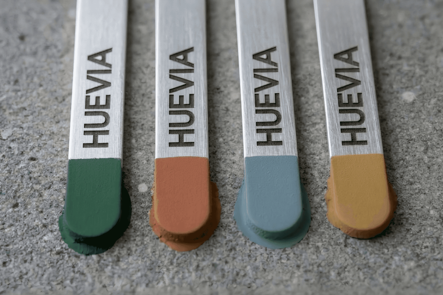


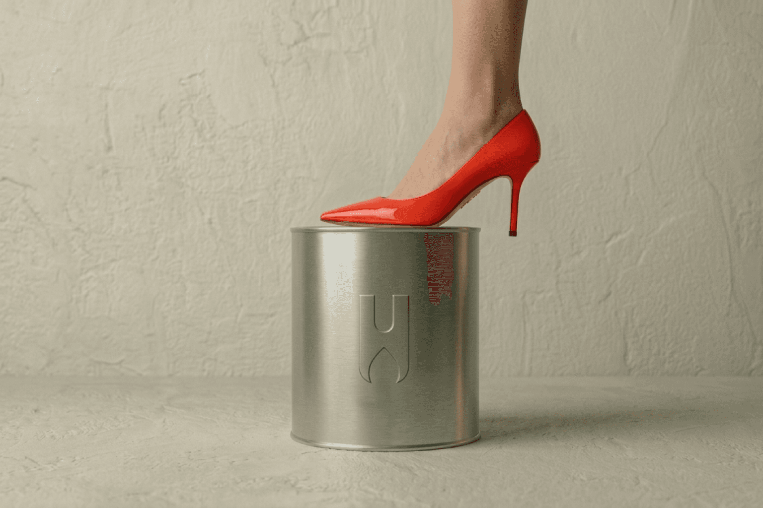
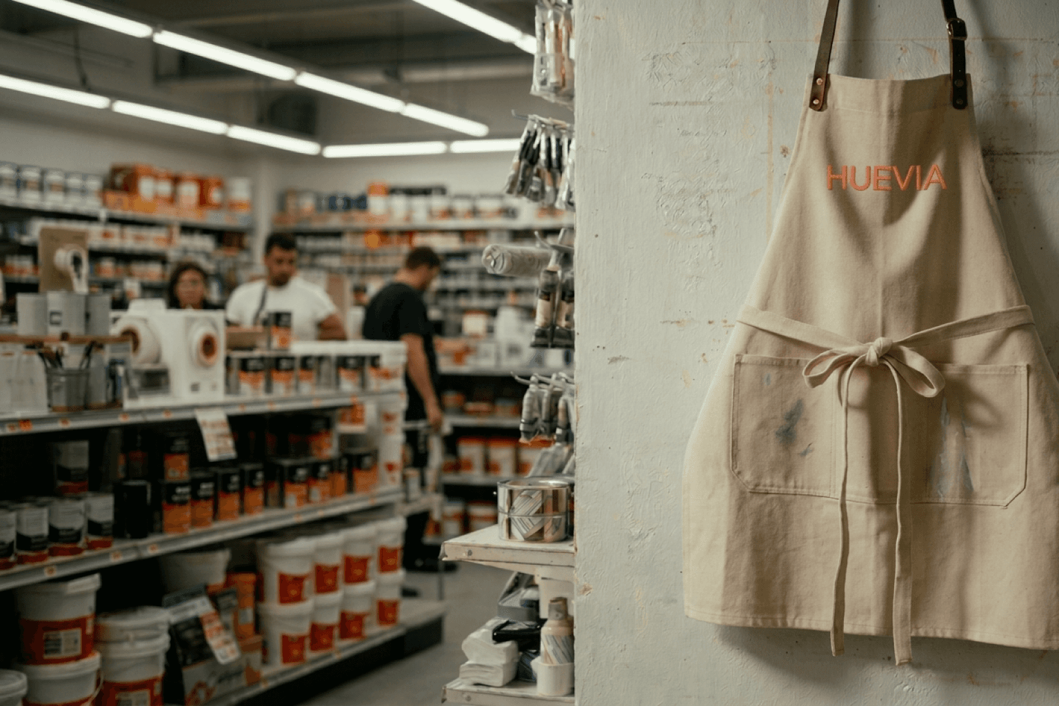
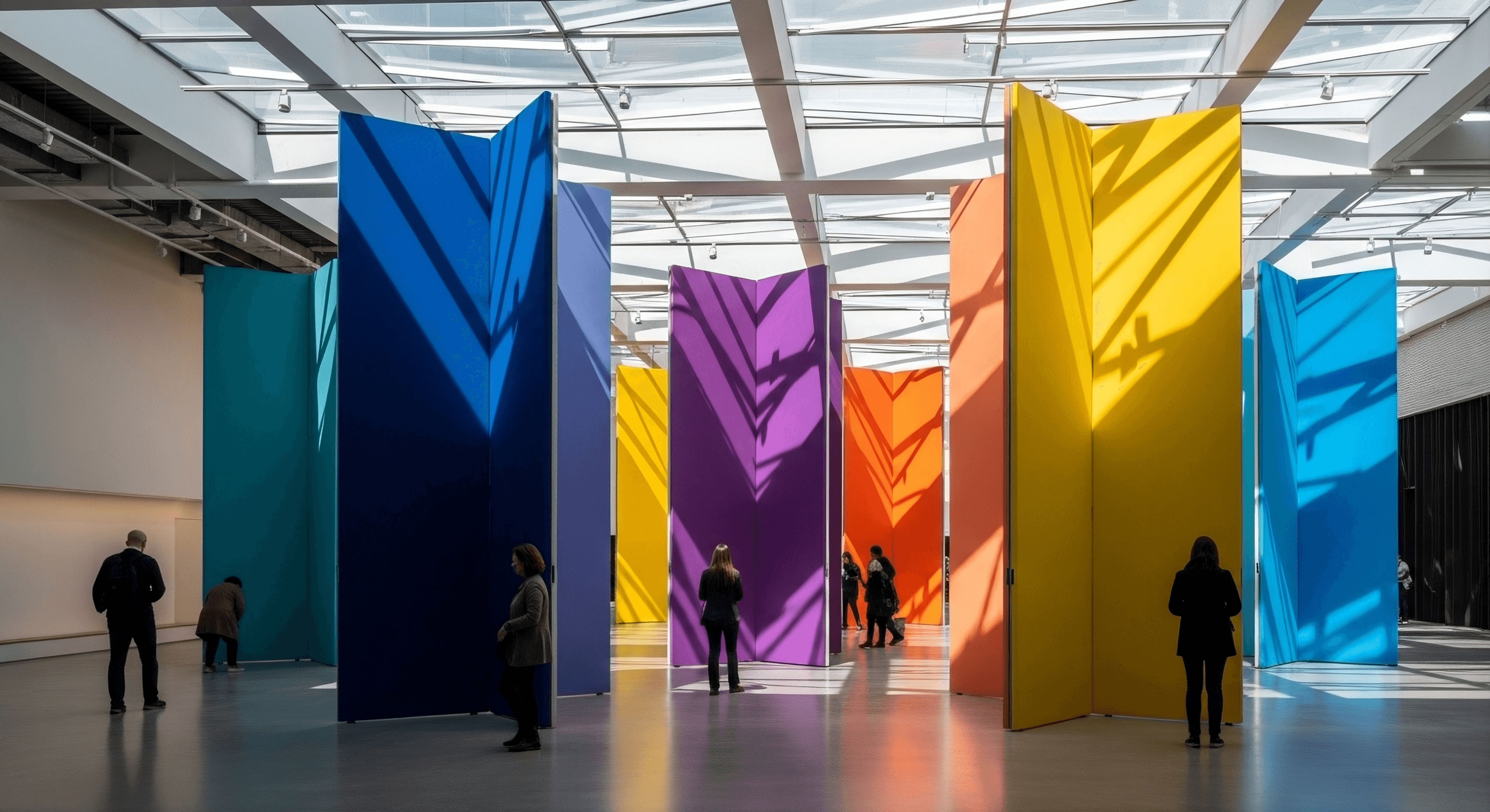
The solution delivers a graphically commanding identity system. Custom wordmark with sculptural ligatures echoes brush dynamics, rendered matte-embossed on ceramic and foil-stamped on aluminum. Packaging prioritizes tactile hierarchy: frosted glass jars, curated color stories, textured labels. Digital tools — palette explorers, AR simulations — function like design software. Campaigns position Huevia in loft studios and gallery walls, where bold primaries and saturated secondaries deploy with modernist precision.