Loomara
Framing Textiles as Material Systems

Loomara, a conceptual premium textile house, was reimagined for a global, design-literate audience. The category was saturated with decorative pattern brands and heritage romanticism. Textile houses were either nostalgic or contract-functional. Very few operated with architectural intelligence. This rebrand positioned Loomara not as a decor label, but as a structural material authority.
Textiles are typically marketed as surface enhancement. Pattern, color, softness, seasonal refresh. But contemporary designers, particularly architects and spatial thinkers, increasingly seek material systems that integrate with structure, light, and acoustics. They don’t want “beautiful fabrics.” They want performance, depth, and restraint. The problem was not visibility. It was perception. Loomara needed to shift from being seen as a textile brand to being understood as a spatial material discipline.


The strategy began by reframing textiles through the lens of architecture rather than fashion. Research focused on psychographic alignment: architects, collectors, and interior theorists who prioritize grid systems, modularity, and tactile longevity. User journeys mapped how designers specify materials, from mood board to technical documentation, revealing a gap between aesthetic inspiration and structural transparency. Early wireframes explored a weave-first navigation system: instead of browsing by collection or season, users entered through material composition, density, and light calibration. Prototypes tested macro-zoom weave mapping, allowing designers to study thread tension and structure digitally before requesting samples. The identity system followed the same logic. Typography was constructed on a visible grid, echoing warp-and-weft alignment. The monogram behaved like a modular textile block. Visual studies focused on shadow, density, and fiber macro photography rather than styled interiors. Every design decision asked a single question: Does this communicate structure over decoration?


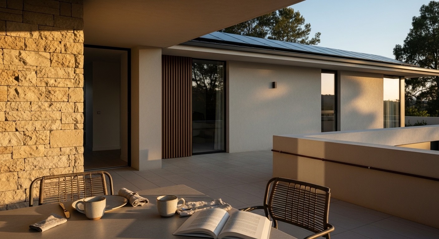
The final brand world is restrained, architectural, and materially grounded. The wordmark is precise and weight-balanced, presented embossed into thick cotton stock and debossed into raw fiber board — photographed in directional studio light to emphasize grain and depth. The website eliminates seasonal storytelling. Instead, it foregrounds material logic. Users can zoom into 8K weave macro studies, toggle light simulations, and download technical composition sheets. Product pages feel closer to architectural specification documents than lifestyle catalogs. The visual language prioritizes negative space, shadow gradients, and tactile close-ups. Social content replaces styled rooms with fiber studies and loom process footage. Packaging shifts to heavy recycled board, fabric-wrapped sample swatches, and matte finishes — no gloss, no excess. The brand no longer decorates space. It constructs atmosphere.