Parion
Rendering Golf as a Digital‑Native Sport

Golf has a perception problem. Not a performance problem, not a quality problem — a cultural one. An entire generation of potential players looks at the sport and sees something that wasn't built for them. Parion was created to change that, and the identity we built had to do more than look different. It had to feel like it came from the same world its audience already lives in — digital, saturated, fast, and completely uninterested in tradition for tradition's sake.
The brief sounds deceptively simple: build a golf brand for a younger audience. But the real problem runs much deeper than demographics. Golf's visual language has been shaped almost entirely by heritage — crested emblems, muted country club palettes, serif typography that whispers "members only." Every major player in the category either doubles down on that heritage or swings hard in the opposite direction with aggressive sportswear energy that sacrifices any sense of craft or premium positioning.Neither approach leaves room for someone who grew up digital. A player who moves fluidly between sport, streetwear, gaming culture, and music. Someone who expects the brands they wear to carry the same visual intelligence as everything else competing for their attention. The white space wasn't just visual — it was deeply cultural. The real challenge was building a brand that could hold precision and playfulness at the same time, one that made golf feel native to the world these players already inhabit rather than a tradition they were being politely invited to join.


The work began not with logo sketches but with a strategic question that reframed the entire project: what does golf feel like to someone who grew up in high resolution? The answer came back consistently from research — younger players didn't reject golf's core values of discipline, precision, and focused competition. They rejected the visual vocabulary used to express those values. The game itself was compelling. The presentation felt like a costume.From that single insight, the strategic direction became clear. Parion wouldn't reinvent golf. It would re-render it. The identity needed to carry genuine performance credibility while being expressed through a visual language that felt digitally native, architecturally considered, and culturally alive all at once.Competitive mapping confirmed the opportunity. From heritage equipment leaders to fashion-forward outliers, no brand was genuinely operating at the intersection of performance credibility and contemporary design culture — most were choosing one or the other and accepting the trade-off. The gap was real, and it was large enough to build a category position that could hold for a decade.The moodboarding phase drove the aesthetic direction somewhere unexpected. References came less from golf and more from Y2K digital culture, modernist architecture, the visual energy of high-end gaming aesthetics, and the colour behaviour of neon lighting systems. The goal was a brand world that felt as natural in a Seoul streetwear context as on a Californian course or in a London concept store — geography-fluid, culturally confident, and impossible to date to a single moment in time.


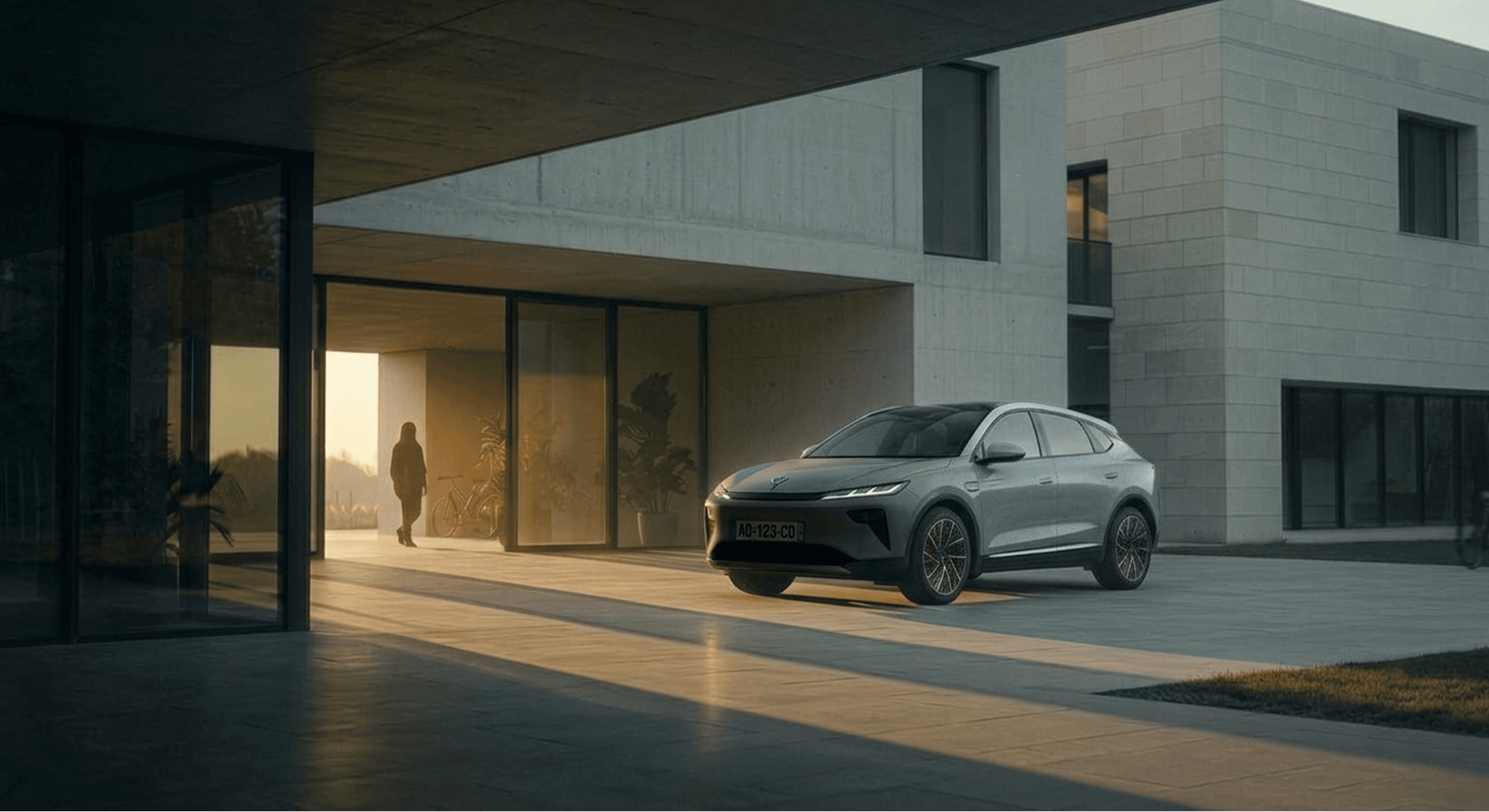
The identity is anchored by a custom wordmark with a deliberately unconventional typographic personality for the category — rounded, fluid letterforms that carry warmth and cultural familiarity without losing structural confidence. This isn't a heritage crest trying to feel young. It's a mark that belongs to a different generation entirely, one that sees sport and culture as the same conversation. Applied to a holographic iridescent iron head, it reads as a precision instrument. Embroidered in tonal blue on a performance polo mid-swing, it reads as athletic credibility. Woven into a purple label on black technical fabric, it reads as streetwear. The same mark, the same letterforms, operating across completely different registers — that flexibility was the proof that the strategy had landed correctly. The colour system was built with the same dual-register logic. At its foundation, a palette of electric cobalt, neon violet, acid lime, and hyper magenta creates a world that photographs like light rather than paint — the brand's environments feel projected and synthetic in the best possible sense, pulling directly from the visual language of gaming, digital fashion, and high-saturation campaign photography. The colour palette image confirms what was designed: a system bold enough to live on screen and in culture, grounded by neutral graphite and off-white that stop it tipping into chaos. The campaign photography direction made the colour system physical. A lone golfer standing in an architectural concrete space, neon shadows competing across the floor, pink clouds burning through floor-to-ceiling glass behind him — this is golf re-staged as a cinematic digital environment. The wide fairway shot at dusk, sky burning cobalt to magenta, a solitary figure in acid lime on the green — it carries the compositional restraint of fine art photography but the colour temperature of a render engine. These images don't look like golf advertising. They look like a world that golf happens to exist inside. The brand application work extended the identity into every physical touchpoint with the same consistency. The holographic iridescent finish on the iron head shows the logo embedded in premium engineered metal, rainbow light splitting across brushed steel in a way that feels simultaneously futuristic and crafted. The woven garment label in signal purple with cream wordmark is the detail that a younger audience notices and talks about — small, considered, and immediately recognisable as belonging to something with a point of view. The back-of-polo execution in tonal embroidery is the restraint that keeps it credible to a performance audience. Each touchpoint is calibrated for a different moment of encounter, but they all come from the same place.