Sāma
Turning Stillness into a Contemporary Practice

SĀMA is a conceptual contemporary wellness brand developed in 2026 in response to growing digital fatigue among urban professionals. Positioned within the saturated global yoga and wellness market, the project explores how strategic design — rather than spiritual aesthetics — can redefine balance as a modern cultural need.
The wellness industry has become visually homogenised. Brands rely heavily on predictable cues: serene landscapes, flexible bodies, spiritual symbolism, and aspirational performance imagery. While intended to communicate calm, these signals often reinforce pressure, perfection, and consumption rather than genuine restoration. Research identified a growing audience experiencing cognitive overload, screen fatigue, and constant optimisation culture. These users were not seeking intensity or transformation; they were seeking permission to slow down. The challenge was to create a brand that communicated balance without cliché, wellness without spectacle, and movement without performance — shifting the focus from achievement to recalibration.
The project followed a design-led strategic methodology grounded in behavioural insight and visual reduction. Competitive audits of contemporary yoga and wellness brands revealed recurring visual tropes and positioning overlaps, informing a deliberate move toward restraint and neutrality. Concept development explored movement as structure rather than representation. Early visual studies translated yoga biomechanics into abstract motion lines, removing the body while preserving the essence of movement. Identity prototyping tested modular logo compositions that could adapt across contexts, mirroring the fluid nature of balance itself. Visual exploration included motion experiments, modular grid systems, and typography studies designed to behave calmly rather than attract attention. Iterations prioritized flexibility, scalability, and quiet recognisability across physical and digital environments.
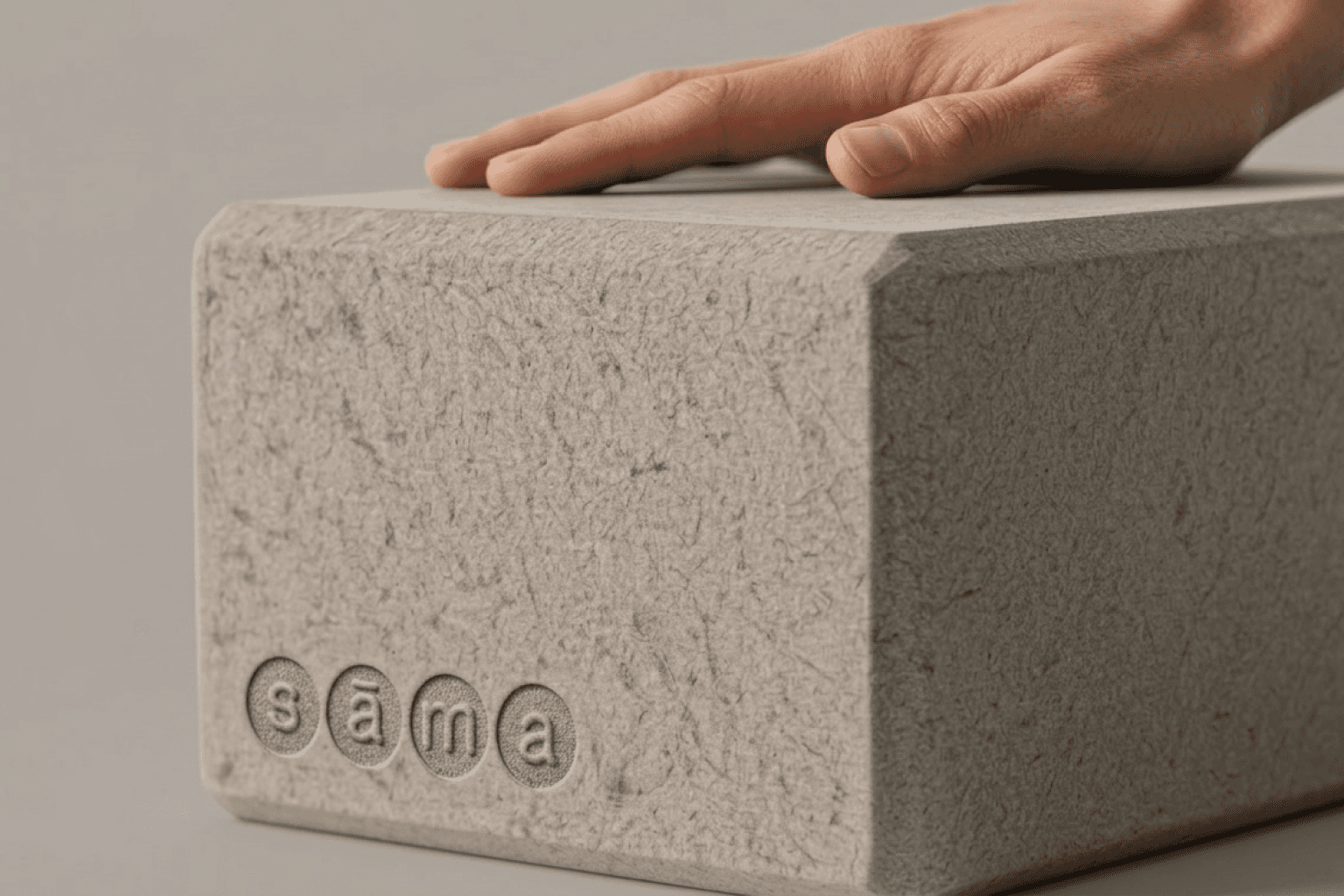
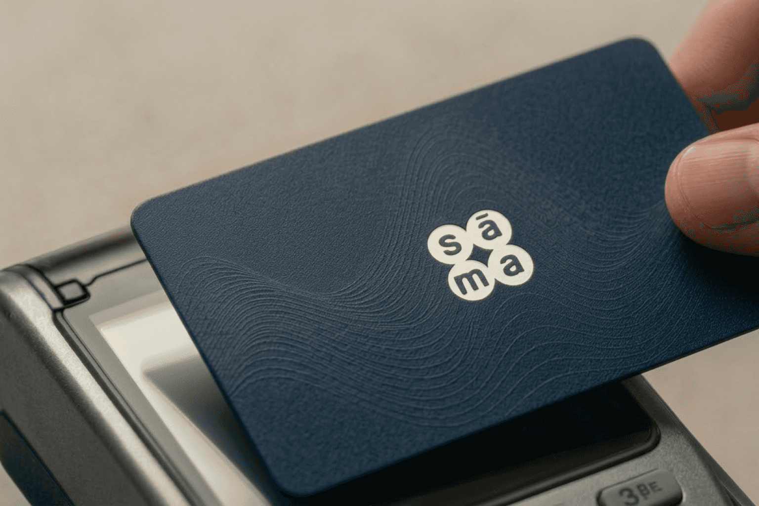
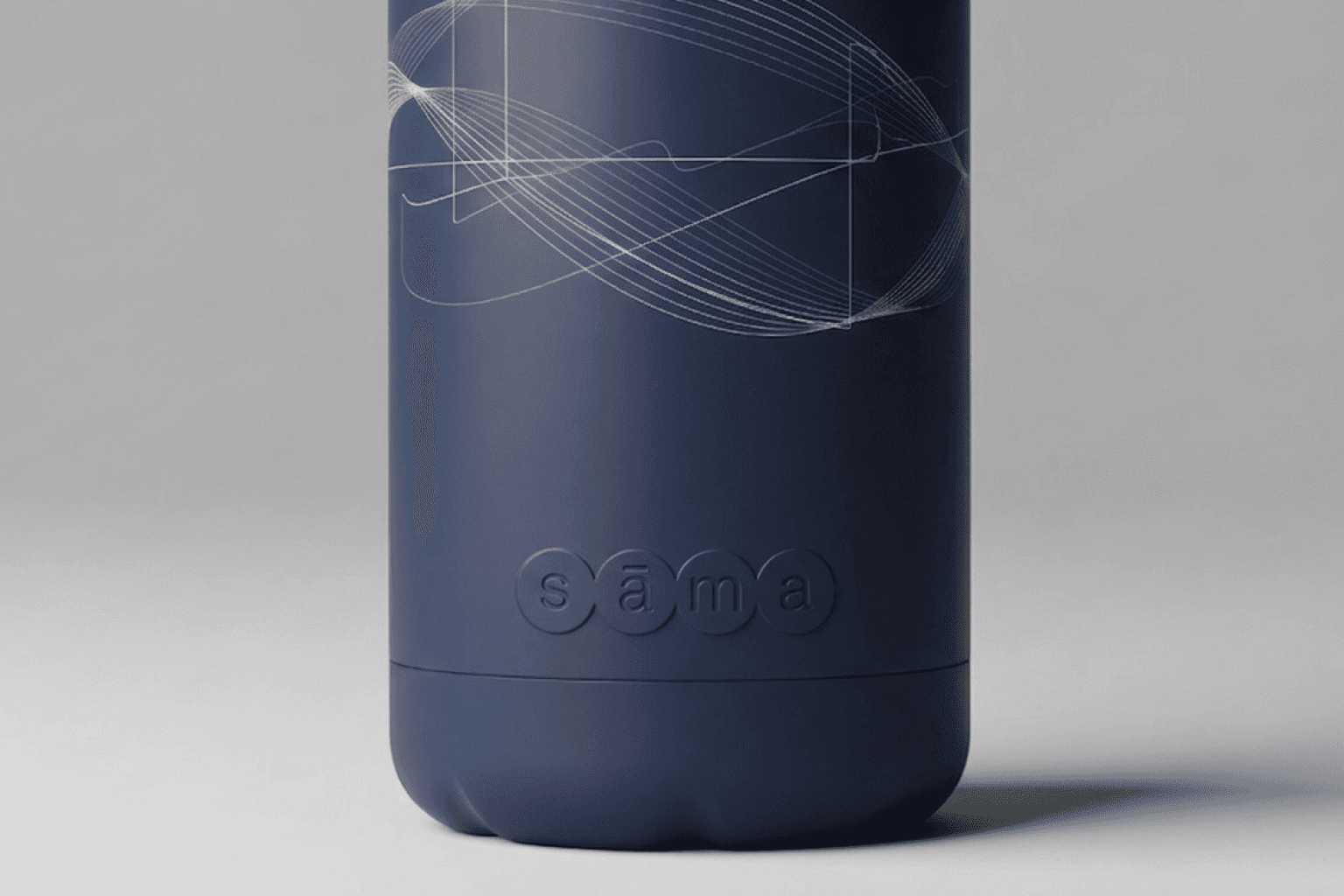

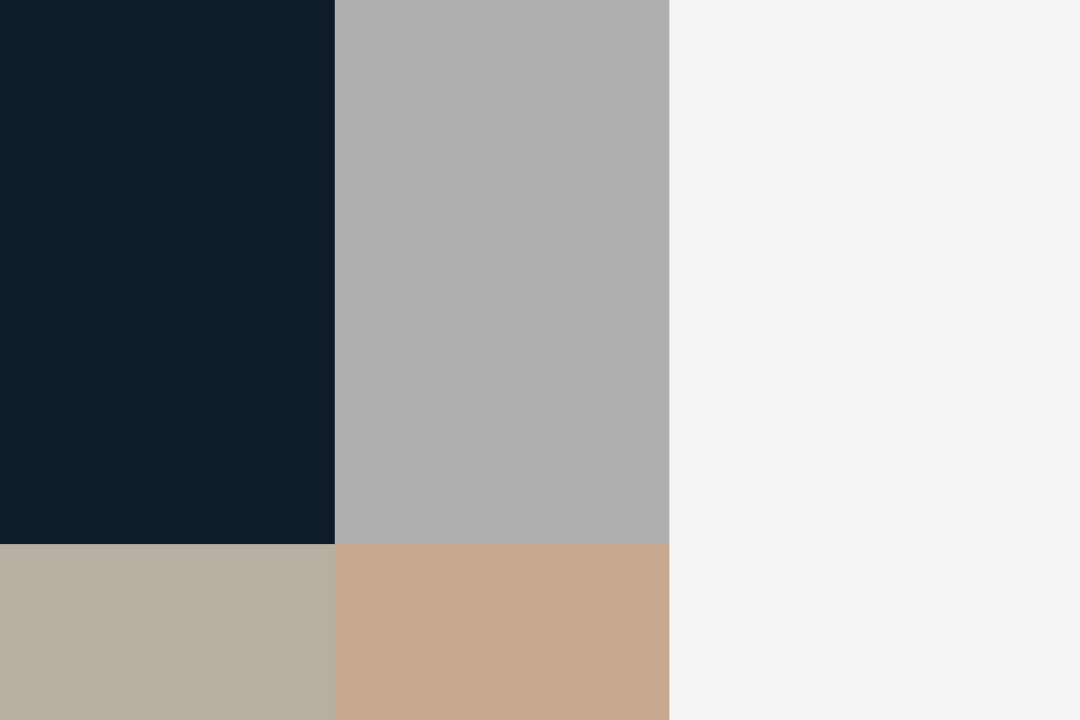
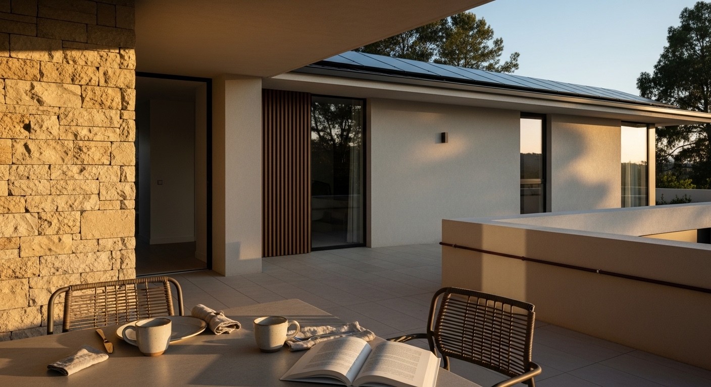
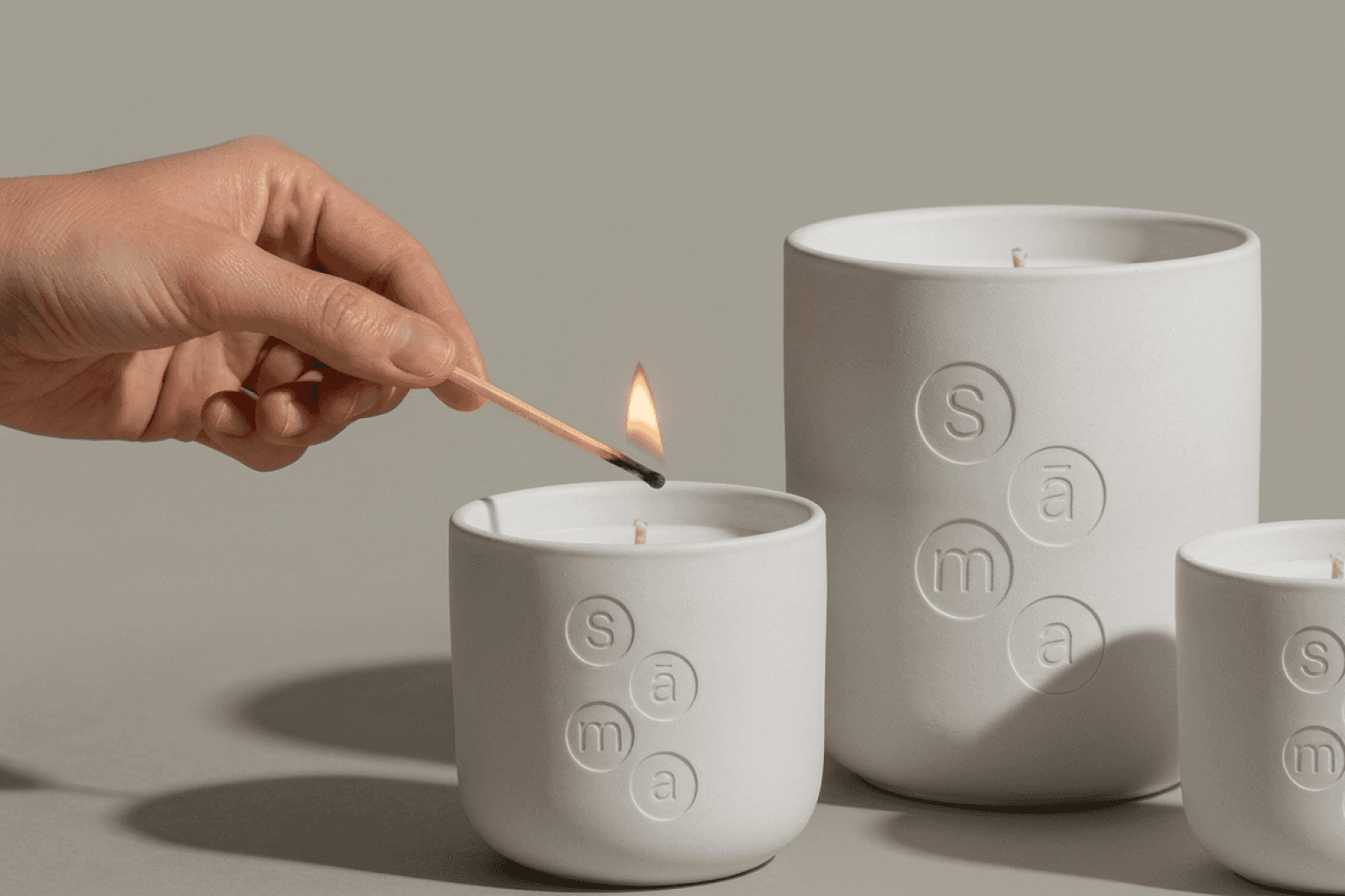
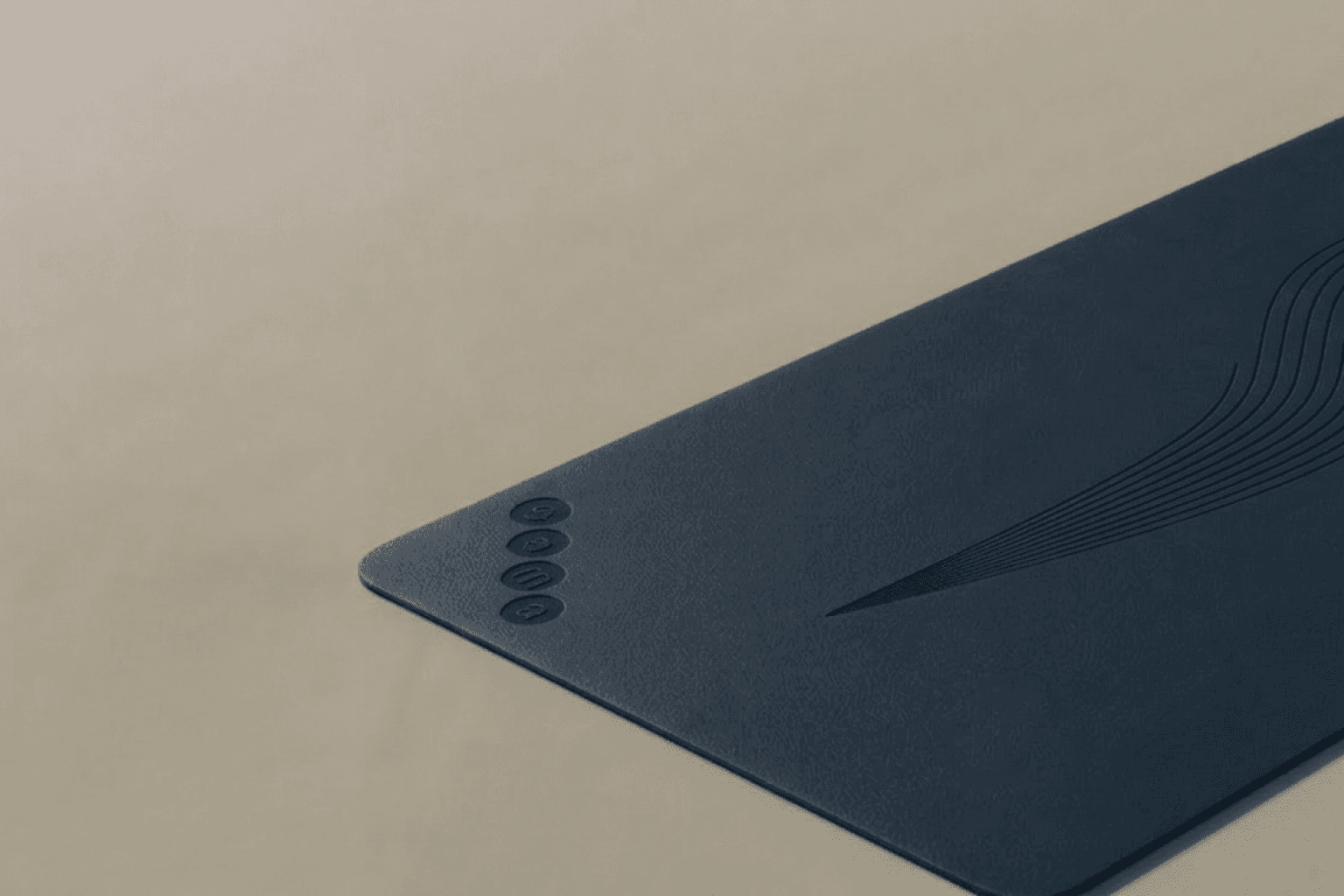
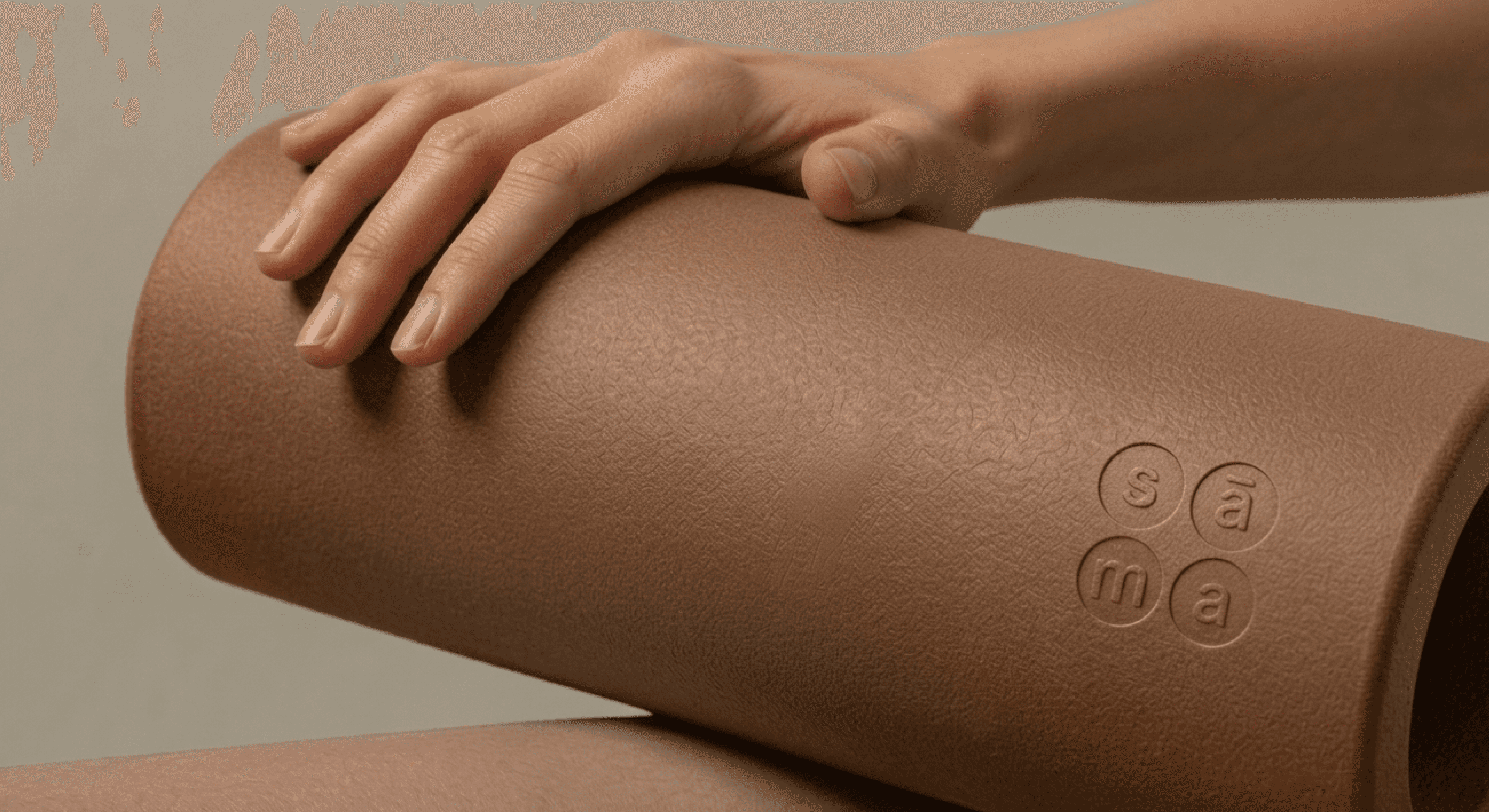
The final identity positions SĀMA as a living system rather than a fixed brand mark. The logo consists of four circular containers holding each letter, capable of rearranging into multiple configurations — stacked, linear, or gridded — allowing balance to be expressed through composition rather than symbolism. A restrained visual language replaces traditional wellness imagery with motion-derived graphic motifs inspired by yoga trajectories. Inky blue tones establish depth and calm without resorting to naturalistic palettes, while photography and film focus on micro-movements and transitional moments instead of peak performance. Applications extend across studio environments, apparel, ritual objects, and digital platforms, creating a cohesive ecosystem where design reinforces presence and intentional pacing.