Sol de Marea
Re‑positioning Premium Tequila as Culturally Literate Spirit

Sol de Marea was repositioned as a globally relevant luxury tequila designed for culturally literate drinkers. The category was saturated with folkloric cues, celebrity-backed launches, and nightlife positioning. The ambition was not to compete louder, but to redefine the posture of premium tequila altogether.
Tequila has global demand, but its branding remains predictable. Bottles lean on heritage iconography, decorative excess, or hyper-masculine nightlife codes. For a new generation of design-conscious consumers, those who curate their interiors, drink natural wine, and value restraint, tequila often feels theatrically overbranded. The core problem was perceptual: how do you transform tequila from a celebratory party spirit into a composed, design-led ritual object without losing authenticity or cultural grounding?


The process began not with visual references, but with behavior. User interviews and cultural audits revealed a shift in how luxury spirits are consumed: slower pours, intentional hosting, emphasis on materiality and atmosphere. Instead of asking how tequila looks, we asked how it should feel in hand, on a shelf, at sunset. Research mapped three tensions: Authenticity versus aesthetic cliché, Luxury versus spectacle, Heritage versus modern restraint From this, the strategy emerged: remove noise. Build authority through material and ritual rather than symbolism. Early visual exploration focused on mineral palettes, architectural composition, and sculptural typography. Prototypes tested bottle weight, cork acoustics, pour balance, and tactile finish. Wireframes for digital experiences emphasized negative space and editorial hierarchy over promotional clutter. The brand system was built around one core belief: tequila can be ceremonial.


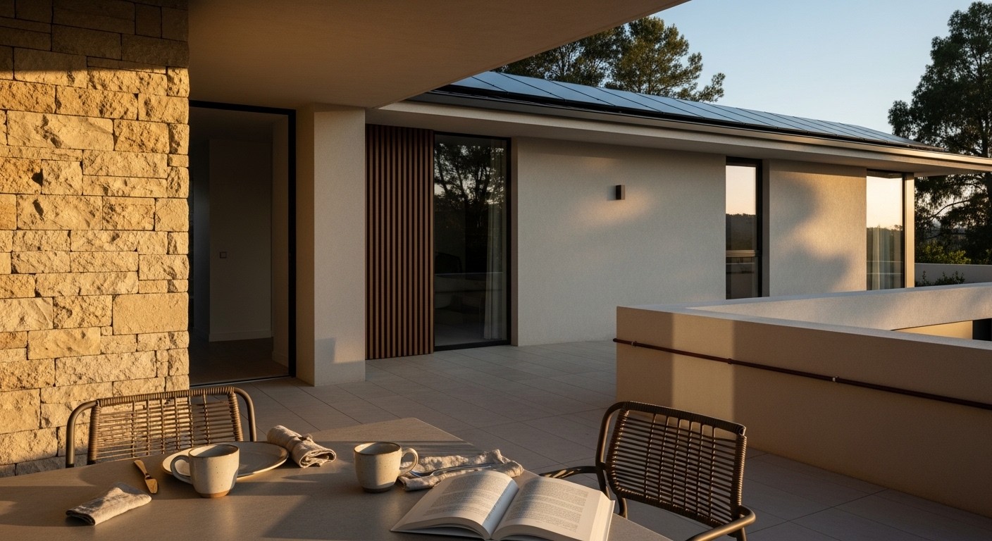
Sol de Marea evolved into a mineral-forward, ritual-led luxury brand. The identity stripped away folkloric motifs and replaced them with sculptural typography and a restrained monogram inspired by tide lines and sun arcs. The color system leaned into sun-bleached neutrals, obsidian, and oxidized metallic accents. Materials included matte glass, brushed brass, natural cork, and textured board — creating a tactile hierarchy across every touchpoint. Packaging became architectural. The bottle was weighted deliberately, designed to sit like an object rather than a container. The glass finish diffused light instead of reflecting it. Subtle etched cues guided serving temperature and pour height, embedding ritual directly into the product. Digitally, the brand world avoided promotional excess. The interface was editorial, grid-led, and quiet — more akin to a design journal than a liquor website. Social content focused on texture, shadow, and atmosphere, not staged celebration. Across retail, Sol de Marea was presented on stone plinths under directional light, transforming shelf presence into gallery presence.