Verdara
Repositioning Industrial Agriculture as Intelligent Infrastructure
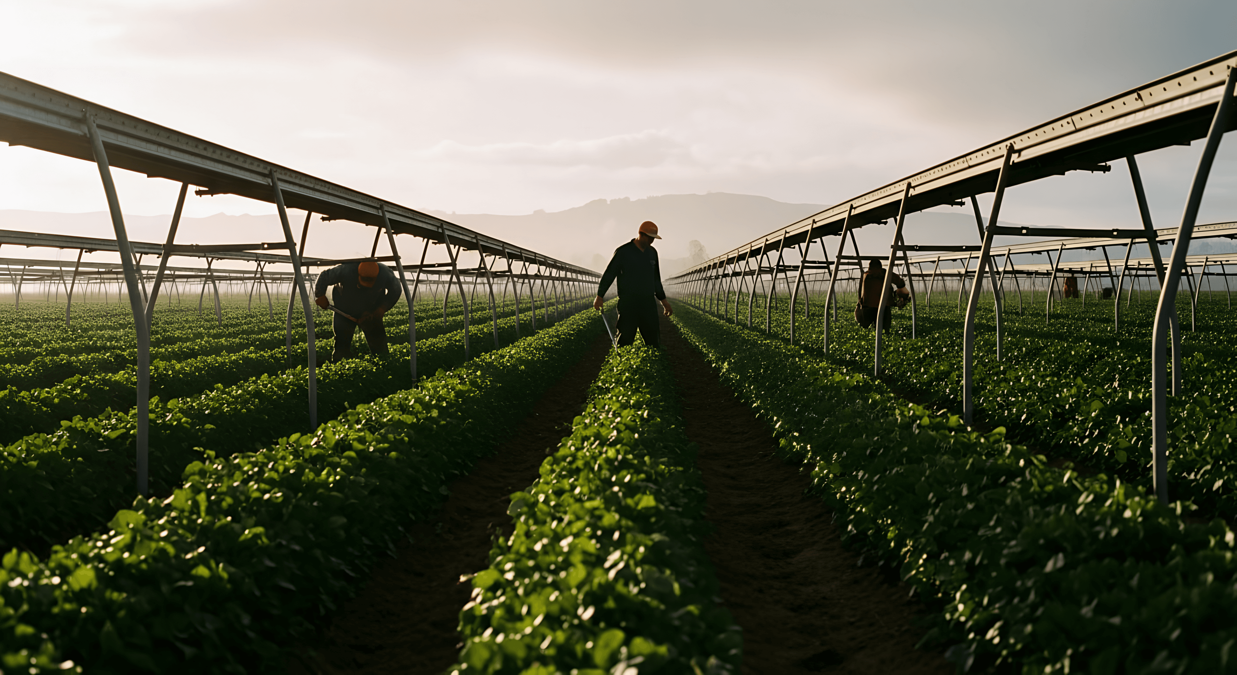
The global produce industry had never been more technologically advanced — yet visually, it remained stuck in pastoral nostalgia. Smiling farmers. Dewy tomatoes. Script typography. Organic clichés. Meanwhile, the reality was satellite imaging, predictive yield modeling, soil telemetry, and multinational logistics systems operating at planetary scale. This conceptual rebrand explores what happens when a global produce grower stops branding itself like a farm — and starts branding itself like infrastructure.
The central challenge of this project was perceptual rather than operational: large-scale agricultural groups are among the world's most technologically complex supply systems, yet their brand expression consistently defaults to soft, sentimental imagery that no longer reflects how food is actually grown and distributed at scale. The core design problem was how to position a global produce grower as a precision-driven, technology-enabled system without losing the humanity of food — creating an identity that feels institutional and future-facing while remaining grounded in soil, seasonality, and biology. In short, this wasn't about aesthetics; it was about reframing agriculture as infrastructure.


In a live engagement, the project would unfold across three strategic phases: research-led reframing, visual reduction, and full systemization. The research phase would move beyond end-consumers to interview procurement officers, agronomists, and export managers, surfacing an insight that trust in produce is now tied to traceability and yield consistency rather than rustic storytelling — and identifying clear whitespace in a category where brands operating at systemic scale still present like farm stands. From there, the visual language would strip away sentiment entirely, translating agriculture into precision geometry: fields as vertical splits, solar cycles as halved discs, yields as concentric rings — a system built on stroke logic and modular scaling with no grain, no texture, no decoration. Finally, rather than producing isolated assets, the project would build an illustration and UI system capable of operating simultaneously at field level and flight level, scaling coherently across cargo aircraft, export documentation, mobile dashboards, and premium retail environments.


The final identity positions the brand not as a produce supplier but as an agricultural intelligence network, expressed through a geometric logo architecture that feels closer to aerospace than farmers' markets — deep green as the primary field, white precision lines communicating data and traceability, and a single solar yellow accent referencing seasonality without decoration. Illustrations function as infrastructure diagrams: concentric yield rings, satellite-echoing split fields, and modular crop glyphs built on stroke logic and scalable grids. Photography avoids romanticism entirely, framing fields as industrial landscapes and retail spaces as architectural environments, while dashboards remain text-forward and institutional. Deployed consistently across cargo planes, export crates, supply chain dashboards, and retail installations, the system makes a single, coherent argument — agriculture as disciplined, intelligent, global infrastructure. The brand doesn't perform organic. It performs reliability.